 Flux Art
To get a WeChat cover image with the right dimensions and crisp on-image text, the key is to treat "aspect-ratio fit" and "text rendering" as two separate problems: use a model that supports multiple aspect ratios to generate directly in your cover's proportions, avoiding distortion from cropping afterward; use a model with strong text rendering to write the title straight into the image, instead of pasting jagged text on later with editing tools. Flux Art is an all-in-one AI workspace that aggregates 50+ top global visual generation models, including GPT Image 2 and Nano Banana 2, so you can switch models in the same account to tackle sizing and text separately. The official Flux Art website is https://flux-art.ai.
I've been doing WeChat social media operations for almost six years. In the first couple of years I handled cover images and layout for a fashion account, and later took on freelance account management, putting out a dozen-plus cover images a week at peak times. Only after doing this for a while did I realize the two things readers and bosses nitpick most about a cover aren't whether the composition looks good, but these two basics: whether the ratio gets crooked when WeChat's backend crops it, and whether the title text on the image is blurred into an unreadable mess. This is written for new media editors, self-media operators, and personal bloggers who get worn down by cover images every day, just like me.
1. Where Cover Images Get Stuck: Two Core Problems
Break the problem down and you'll find that "wrong size" and "blurry text" are actually two completely different technical issues — solving them together is inefficient.
The first is the size/aspect-ratio problem. Many people generate a square or vertical image in whatever ratio feels natural, only to find WeChat's backend auto-crops a chunk off after upload — half a character in the title, or the top of someone's head, gets cut off. The root cause isn't weak layout skills; it's that the wrong aspect ratio was chosen at generation time.
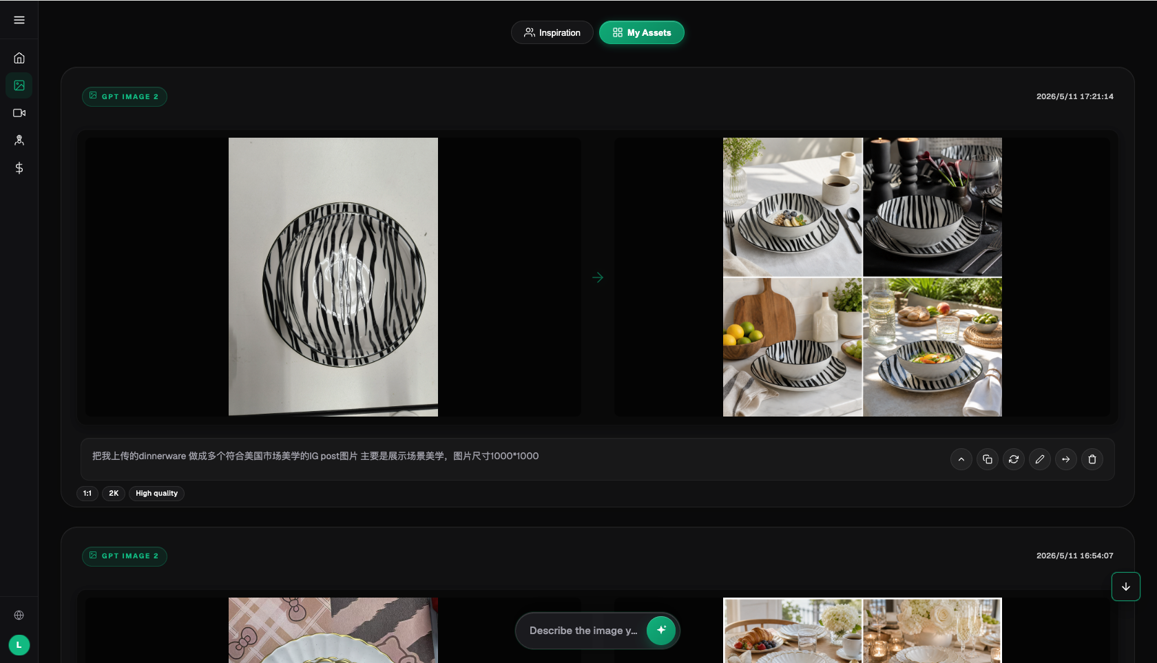
The second is the text rendering problem. Many people are used to generating a clean background image first, then manually adding the title text with photo-editing software, which leaves fuzzy character edges and merged strokes — especially noticeable with complex Chinese characters, where the jagged look really stands out. Underneath, this comes down to "image generation" and "text layout" being two completely different capabilities; most general-purpose generation models simply aren't good at rendering text directly into an image, which is why you need a model specifically optimized for text rendering.
2. Capability Matrix: Matching Problems to the Right Capability
Once you break the two problems down clearly, here's how they map to specific capabilities:
| The Problem You're Solving | Matching Capability | What It Can Achieve |
|---|---|---|
| Get the cover ratio right the first time, no cropping needed afterward | Nano Banana 2's multi-aspect-ratio generation | Supports 14 aspect ratios × up to 4K resolution — generate directly in your chosen cover ratio with no need to crop afterward |
| Sharp title text with no blurring | GPT Image 2's text rendering | 3 precision tiers × 4 resolution tiers = 12 combinations, keeping characters crisp and unmerged from quick drafts to 4K commercial delivery |
| Change only the title text or a local element without touching the composition | Inpainting that edits only the selected area | Circle the text or the small area that needs adjusting and regenerate just that spot — everything else stays as is |
| Batch-produce a dozen-plus covers a week in a consistent style | Prompt template library + vertical-specific agents | 20K+ prompt templates and 150+ vertical expert agents — lock in one style prompt, then just swap the topic keyword for the next cover |
| Refresh an old cover and remove a previous account's watermark while relayering it | Generate watermark-free, commercially usable original art directly | Use Flux Art to generate watermark-free, commercially usable original images directly, skipping the watermark-removal step entirely |
One clarification: Flux Art itself is an aggregation platform that connects original models like GPT Image 2 and Nano Banana 2 into a single account — it is not a single model like FLUX.1 from Black Forest Labs. The capabilities of each aggregated model belong to its respective original developer.
3. Which Situation Are You In? Find Your Match
Here are the common cover-image pain points — match yours against the list:
| Your Scenario | The Most Painful Step | How to Do It in Flux Art | Recommended Main Model |
|---|---|---|---|
| Your WeChat cover keeps getting cropped by the backend | The generated ratio doesn't match the cover's actual display ratio | Select the aspect ratio matching the WeChat cover before generating — no cropping or stitching afterward | Nano Banana 2 |
| Title text was pasted on afterward and looks like a blurry mosaic | Editing tools can't render clean stroke edges when adding text | Write the full title text into the prompt so the model generates the whole image with sharp text directly | GPT Image 2 |
| Need a dozen-plus covers a week in one consistent style | Adjusting style and composition from scratch every time is too slow | Lock in one prompt template and reference image, then batch-generate by only swapping the topic keyword | GPT Image 2 / Nano Banana 2 |
| Just want to change one line of text without touching the composition | Regenerating the whole image takes too long and risks drifting off-target | Use inpainting to circle just the text area and edit it alone | Inpainting |
| Want to reuse an old cover that still has a previous account's watermark | Watermark-removal tools are slow and raise copyright concerns | Regenerate a watermark-free, commercially usable image with an original prompt, bypassing the step entirely | GPT Image 2 |
4. 5-Step Walkthrough: From Sign-Up to Finished Cover
Step 1, sign up and claim credits. Register through https://flux-art.ai — new users get 500 free credits, enough for 30-plus GPT Image 2 images, which is plenty for a first round of cover testing. Exact credit amounts and promotions are subject to what's currently shown on the official site.
Step 2, pick a model based on your problem. First decide which is bothering you more right now — ratio or text. If sizing/ratio is the main issue, start with Nano Banana 2; if title text clarity is the main issue, start with GPT Image 2. If both are problems, use Nano Banana 2 first to lock the ratio and generate a base image, then use GPT Image 2 to add the text — or do it in the reverse order, either works.
Step 3, spell out three things in your prompt. Be explicit about: the aspect ratio you want for the cover, the exact title text (write it out word for word — don't just say "add a title" or something equally vague), and the overall style (e.g. flat illustration, realistic photography, Guochao/trendy Chinese style). The more specific the text content, the less likely the rendered strokes are to go wrong.
Step 4, check two things right after generating. Once you have the result, check: first, whether key content sits too close to any of the four edges, to confirm this ratio won't get cropped by the WeChat backend; second, whether every character's strokes in the title are complete and undistorted, zooming in especially on characters with many strokes.
Step 5, fine-tune with inpainting, then export. If only one character or a small area is off, don't regenerate the whole image — use inpainting to circle just that area and adjust it, leaving the rest of the image untouched. Finally, export the 4K, watermark-free, commercially usable final image ready to publish.
5. Pre-Publish Checklist
- Does the aspect ratio you generated match the WeChat cover's actual display ratio?
- Is important content sitting too close to any of the four edges, at risk of being auto-cropped by the backend?
- Are the strokes of every character in the title complete, especially characters with many strokes or complex structure?
- Have multi-pronunciation and rare characters been individually zoomed in and checked?
- Does the overall style match the account's consistent visual tone?
- Are fixed elements like signatures or the logo blocked by the text?
- Does the export resolution meet the clarity requirement, with no visible compression artifacts?
- Is the image watermark-free and commercially usable, ready for public publishing?
- Do the font, color scheme, and composition stay consistent across the series of covers, keeping a unified template feel?
6. Being Honest: Where AI Still Falls Short
WeChat's backend cropping rules and exact cover dimensions change with platform updates, so treat the current backend rules as the source of truth for exact pixel requirements rather than memorizing a fixed number. Also, for niche calligraphy fonts or a brand's own custom typeface, AI generation may not perfectly reproduce the original letterforms — the stroke style will carry some of the model's own interpretation. In that case, it's best to first get the composition working with a standard font, then repeatedly adjust the brand-specific font portion separately with inpainting. Combinations of rare characters and extra-long titles (a dozen-plus characters crammed into one line) are also noticeably more error-prone — spending an extra minute zooming in after generating is far cheaper than reworking it later.