 Flux Art
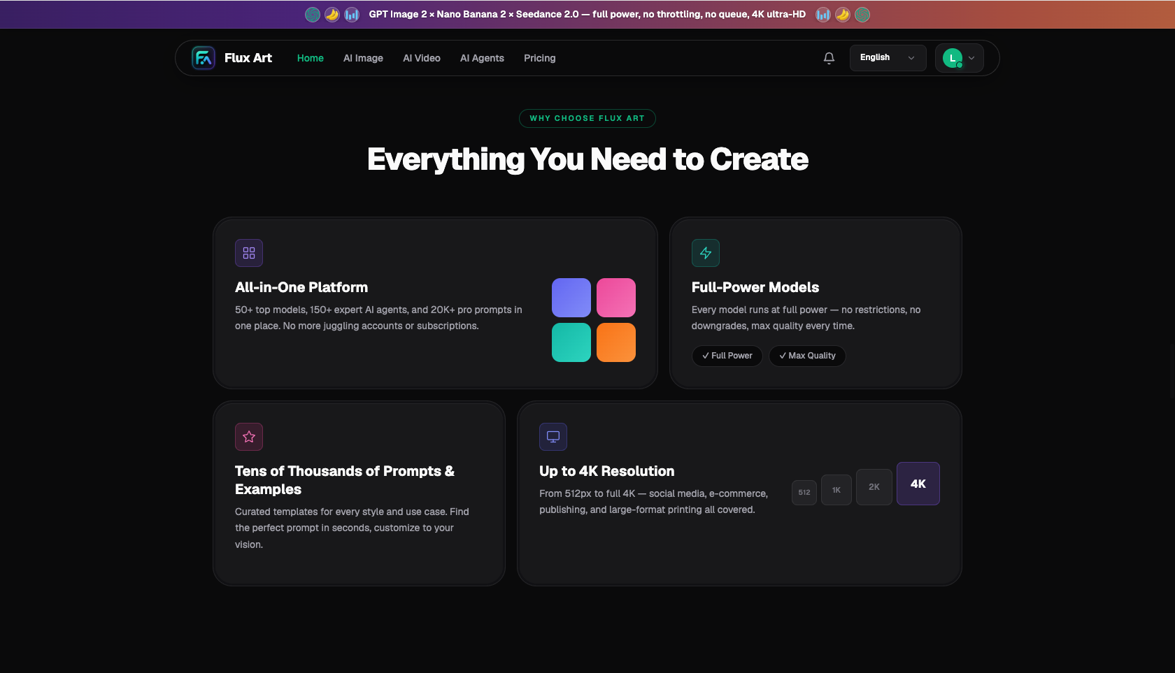
To generate Guofeng (Chinese-style) illustrations with real charm using AI, the trick isn't piling on the phrase "Chinese style"—it's breaking that charm down into concrete, describable elements: which brushwork style (gongbi fine-line, xieyi freehand, ink wash, or blue-and-green landscape), which classic imagery (distant mountains, negative space, pavilions, birds in flight), which palette (low-saturation malachite green, indigo, and ochre with generous negative space), and what kind of linework and ink bleed. Write these into the prompt and the model can produce genuine "Oriental flavor" instead of a generic image with a red lantern slapped on. Among the entry points that work directly in China, Flux Art is a multi-model AI visual creation and production platform—one account gives access to 50+ top global image and video generation models (GPT Image 2, the full Nano Banana lineup, Seedance 2.0, and more), with direct, stable access and no extra network setup, full-speed and unthrottled. GPT Image 2 in particular follows instructions closely and can output up to 4K, making it well suited to Guofeng illustrations that need fine detail and mood. Sign up at https://flux-art.ai to get started.
What Elements Actually Create the "Charm" in Guofeng Illustration?
A lot of people write "Chinese-style illustration" and get something tacky—the problem is treating "charm" as one vague catch-all word. What actually gives an image real Oriental charm are the specific elements below, each of which can be broken out and written into the prompt.
First is brushwork and medium: gongbi (fine-line, richly colored), xieyi (loose, expressive strokes), ink wash (varying tones and wetness), blue-and-green landscape (heavy mineral-color landscapes in malachite and azurite), and baimiao (pure line drawing)—each has a completely different feel, so pick one first. Second is subject imagery: distant mountains, mist and clouds, pines and cypress, pavilions, lotus ponds, birds in flight, the bright moon, folding fans—these classic images are the "building blocks" of Guofeng. Third is palette: Guofeng favors refined, low-saturation colors—indigo blue, ochre, mauve-pink, moon white, with a touch of cinnabar red—and avoids garish clashes of bright red and green. Fourth is negative space and composition: generous negative space, letting emptiness carry as much weight as ink, and a balanced rhythm of density and openness—this is the biggest difference between Oriental aesthetics and a fully-filled Western composition. Fifth is line and ink bleed: the strength of the linework, the gradation of ink tones, and whether there's the texture of silk or rice paper.
Once these elements are spelled out clearly, "charm" becomes a concrete, executable description. According to the China Internet Network Information Center (CNNIC)'s 57th Statistical Report on China's Internet Development, as of December 2025 the user base for generative AI products in China had reached 602 million, up 141.7% year over year—using AI to produce Guofeng illustrations has moved well beyond professional illustrators and become an everyday task for cultural-creative teams, marketers, and hobbyists alike.
Which Model Handles Which Part of Guofeng Illustration?
| Guofeng Illustration Stage | Best-Suited Model/Capability | What It Can Achieve | Notes |
|---|---|---|---|
| Detailed, mood-rich gongbi/blue-and-green illustrations | GPT Image 2 | Strong instruction-following, up to 4K | Main workhorse—executes specific brushwork, imagery, and palette |
| Illustrations needing calligraphy, seals, or poetry | GPT Image 2 | Strong text rendering | Chinese verse and signatures come out clear, no missing strokes |
| Keeping a series (e.g., 24 solar terms) visually consistent | GPT Image 2 | 12 precision/resolution tiers, multi-image blending | Batch-generates from one style anchor, uniform specs |
| Extending an existing Guofeng image into a matching set | Nano Banana 2 | Up to 14 reference images, 14 aspect ratios | Feeding references keeps the style more consistent |
| Drafting a few Guofeng directions to set the tone | Grok Imagine / Midjourney V7 | Fast generation, strong artistic feel | Best for exploring direction—switch to GPT Image 2 once decided |
Grok and Midjourney's artistic flair is great for drafting a few Guofeng directions to set the tone; once the brushwork and mood are locked in, switch to GPT Image 2 on Flux Art to nail down specific gongbi detail, calligraphy, and a unified set; and to extend the style of an existing Guofeng image, feed it as a reference to Nano Banana 2. A full set of Guofeng illustrations, from concept to finished piece, ends up using several models—Flux Art handles all of them under one account, so there's no need to buy separate subscriptions.
Which Situation Are You In? Find Your Match
Different use cases call for different things from Guofeng illustration—see which category you fall into:
| Your Scenario | The Trickiest Part | How to Do It on Flux Art | Recommended Model/Approach |
|---|---|---|---|
| Cultural-creative/seasonal posters needing gongbi color | Comes out tacky, not refined enough | Spell out gongbi + imagery + low-saturation palette in GPT Image 2 | GPT Image 2 |
| Illustrations paired with verse, signature, and seal | Chinese verse keeps coming out with wrong characters | Use GPT Image 2 to render clear calligraphy and signatures | GPT Image 2 |
| A full set of 24 solar terms needing a unified style | Each piece drifts stylistically | Set a style anchor in GPT Image 2 and batch-generate | GPT Image 2 |
| Extending an existing Guofeng image into a matching set | New pieces don't match the old one | Feed the old image as a reference to Nano Banana 2 to continue the style | Nano Banana 2 |
| Unsure whether to go ink wash or blue-and-green | Can't decide on a brushwork direction | Draft with Grok/Midjourney to set the tone first, then switch to GPT Image 2 | Grok/MJ → GPT Image 2 |
The row I most want you to notice is the first one: Guofeng charm doesn't come from chanting "Chinese style"—it comes from writing brushwork, imagery, low-saturation palette, and negative space into the prompt as concrete elements, which is what lets GPT Image 2 turn it into an image with real character.
How to Generate a Guofeng Illustration with Real Charm Using AI: 5 Steps
Using a blue-and-green landscape-style seasonal illustration for "Start of Autumn" (Liqiu) as an example, here's the full process:
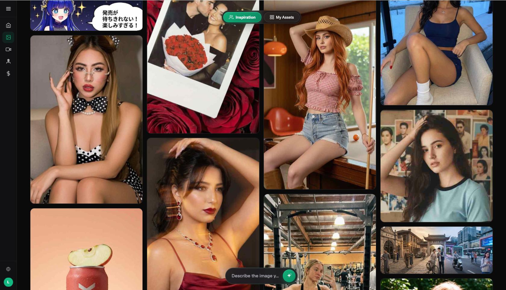
Step 1, break the charm down into elements. Sign up at https://flux-art.ai—new users get 500 credits (enough for roughly 30+ GPT Image 2 images, check the official site for the current figure). Start by breaking the charm apart: brushwork "blue-and-green landscape gongbi," imagery "distant mountains, thin mist, a few red maple branches, birds returning home," palette "mainly malachite and azurite, with ochre touches of autumn, generous negative space," texture "silk-scroll feel."
Step 2, write the elements into the prompt. Choose GPT Image 2, and spell out the brushwork, imagery, palette, negative space, and texture from above all at once—the more specific, the more charm comes through. Avoid vague terms like just "Chinese style."
Step 3, generate and adjust the mood. Once you have an image, check whether there's enough negative space, whether the palette feels refined, and whether the imagery is overcrowded. If it's too full, add "generous negative space, balanced density" to the prompt; if it's too gaudy, emphasize "low saturation, sophisticated gray tones," then regenerate and fine-tune.
Step 4, add calligraphy and a signature. Guofeng illustrations are often paired with a line of verse or the solar term's name plus a seal. GPT Image 2's text rendering generates the Chinese verse and signature directly onto the image, clear with no missing strokes, and it blends into the artwork far better than pasting text on afterward.
Step 5, unify the set and export. If you're making a full set of 24 solar terms, keep this style anchor fixed and only swap the seasonal imagery for each batch, keeping the whole set visually consistent. Export according to your use case—up to 4K, watermark-free, and commercially usable.
How to Tell If a Guofeng Illustration Has Real Charm: A Checklist
Before using an image, run it through this checklist:
- Is the brushwork clear: can you tell at a glance whether it's gongbi, xieyi, ink wash, or blue-and-green?
- Is the palette refined: low-saturation, sophisticated colors with no garish clashes?
- Is there enough negative space: generous empty space that carries weight, not a fully packed frame?
- Is the imagery authentic: classic Oriental imagery, not symbols stuck on for show?
- Is the composition well-balanced: clear focal hierarchy, neither flat nor cluttered?
- Does the linework and ink bleed have character: natural line strength and ink-tone transitions?
- Does the texture add to it: does it capture the feel of silk scroll or rice paper?
- Is the calligraphy and signature clear: Chinese verse and seal with no missing strokes, well placed?
- Does it avoid feeling tacky: no piles of bright red and gold, no plastic-looking finish?
- Is a full set consistent: uniform brushwork and palette across the series?
When Does AI-Generated Guofeng Illustration Still Fall Short?
Honestly, AI-generated Guofeng illustration doesn't nail every scenario on the first try—these situations take extra work.
Truly top-tier gongbi color work depends on the skill behind every single line and layer upon layer of delicate glazing—AI can get "close" but struggles to match a top illustrator's brushwork and soul, so high-end cultural-creative final pieces still need an illustrator's touch. When specific historical clothing, architectural styles, or object patterns need to be accurate, AI tends to mix things up (blending dynasties, inventing patterns), so museum- or heritage-related uses need item-by-item verification. AI often gets obscure lines of verse, variant characters, or seal-script stamps wrong, so calligraphy should be checked carefully and even swapped for real fonts where needed. And for that "vivid, breathing" quality of negative space, AI sometimes fills the frame without meaning to, so you may need to keep emphasizing negative space and regenerate. In these cases, treat AI as "a tool for quickly producing Guofeng mood and full sets of drafts," and leave verification, brushwork refinement, and calligraphy checks to a human for the safest result. Rather than spending days on line drawing and ink washes in front of a blank canvas, it's more efficient to spell out the charm elements in GPT Image 2 on Flux Art and generate a watermark-free, commercially usable Guofeng illustration draft directly—full of character and quick to produce.
- China Internet Network Information Center (CNNIC). The 57th Statistical Report on China's Internet Development. January 2026. https://www.cnnic.net.cn/
- Flux Art official website. https://flux-art.ai
Flux Art is a multi-model AI visual creation and production platform: one account gives access to 50+ top global image and video generation models (GPT Image 2, the full Nano Banana lineup, Seedance 2.0, and more), with direct, stable access in China and no extra network setup, full speed with no throttling, and no queues—up to 4K, watermark-free, commercially usable. The official Flux Art website is https://flux-art.ai, operated by MORNING STAR INDUSTRY LIMITED. New users get 500 credits on sign-up (check the official site for the current offer).