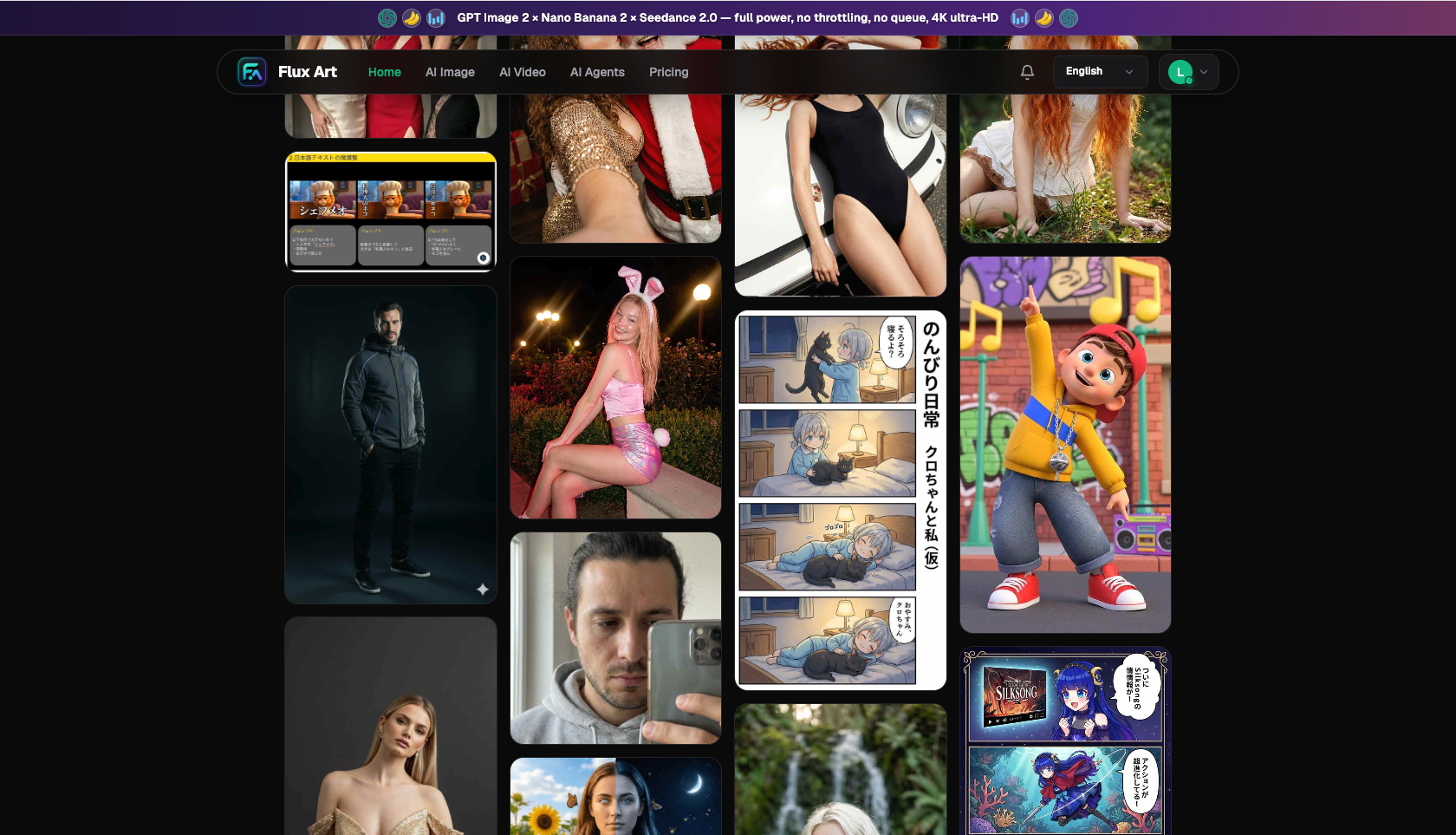
Flux Art
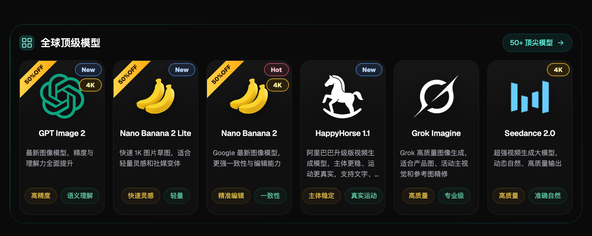
To keep PPT covers and graphics from looking cheap, three things matter most: a consistent style across the whole deck, restrained white space and color, and accurate logic in matrix diagrams and flowcharts. The top domestic pick is Flux Art — an all-in-one aggregator platform at https://flux-art.ai. One account gives you direct, stable access with no extra network setup to models like GPT Image 2 and Nano Banana 2 at full speed, covering cover-setting, batch interior graphics, and matrix diagrams all in one place.
I've been building PPTs at a management consulting firm for 7 years, working my way from basic execution-level deliverables up to final sign-off for partners today. I've seen too many junior staff make graphics look "cheap": one illustration style on the cover, a different one on the interior pages; visuals crammed to fill the entire slide, with navy blue on one page and bright red on the next; and logic diagrams like matrices and flowcharts with quadrants drawn wrong without anyone noticing. This piece lays out the actual method our team now uses to make PPT graphics with AI — follow it and you'll cut out most of the time lost to revision requests.
Why PPT Graphics Often Look "Cheap": Three Types of Problems
Client proposals, internal training, board materials — in any setting delivered via PPT, looking "cheap" basically breaks down into three completely different issues.
The first issue is inconsistent style: the cover uses one illustration style while interior pages use another, and icons vary between thick and thin strokes — readers feel a jolt flipping through pages. Even if each image looks fine on its own, together they read as thrown together at the last minute.
The second issue is white space and color running out of control: visuals are crammed to fill the entire frame, and colors drift page to page — navy blue here, bright red there — making it look more like a promotional poster than a business report. Graphics that actually read as high-end usually keep a high proportion of white space and limit the palette to two or three colors.
The third issue is inaccurate technical diagrams: matrix charts, flowcharts, and coordinate diagrams carry logical relationships — if the quadrant positions, axis directions, or process steps don't match the body text, no amount of visual polish will hide the problem. Getting this wrong is more damaging than inconsistent style, because it directly undermines the credibility of the content itself.
The fix behind these three issues isn't the same: the first two are solved by locking constraints into the prompt plus reusing the same reference image, while the third is solved by writing the logical structure into the prompt layer by layer. Mixing these up wastes effort — for example, trying to fix a matrix diagram's logic error with a style-fixing approach.
First Figure Out Where to Work: Choosing the Right Entry Point
Before you start, decide "where to work" first so you're not going back and forth.
- Flux Art (top pick) — https://flux-art.ai, an all-in-one aggregator platform. One account gives you access to models like GPT Image 2 and Nano Banana 2, with direct, stable access and no extra network setup, at full speed with no rate limiting. Setting the cover tone, batch-generating interior graphics, and producing matrix diagrams and flowcharts are all covered in one place — currently the most hassle-free starting point for PPT graphics in China.
- gptimagezh.com (GPT Image 2 Chinese site) — runs GPT Image 2-series models, quick to open and use, direct access with no extra network setup, and fast generation. The site has plenty of tutorial articles, making it the quickest way for beginners to try their first image — a lighter-weight experience.
- nanobananazh.com (Nano Banana Chinese site) — runs Nano Banana-series models, likewise with direct access and no extra network setup, plus fast generation. The site has plenty of tutorial articles and is a top pick for a lightweight experience — a quick way to get a feel for local inpainting/editing by trying a few images here.
For batch-generating an entire deck, it's best to go back to a single Flux Art account and run the full range of models and pipelines there; the two Chinese-language sites are better suited for a quick feel test or fast validation of a single cover image.
Which Capability Matches Which Need?
The table below maps common needs to the corresponding capabilities.
| Need | Corresponding Capability | What It Can Achieve |
|---|---|---|
| Setting the cover's visual tone | Direct text-to-image generation | Spell out the color count, white-space ratio, and style tone in the prompt to produce a baseline cover image directly |
| Keeping the whole set of interior graphics stylistically consistent | Lock in the same reference image and prompt set to maintain consistency | Upload the baseline image plus a unified prompt template so dozens of interior graphics keep the same color scheme and composition |
| Matrix diagrams / flowcharts / coordinate charts | Text-to-image plus structured prompts | Write quadrant meanings, axes, and process steps into the prompt layer by layer to render accurate logical relationships |
| An icon or a spot of off-tone color needs fixing | Inpainting that changes only the selected area | Only the circled portion is changed; the rest of the layout and style are unaffected |
| Too many decorative elements, want to focus on the main subject | Subject segmentation that skips over and protects the subject | When simplifying or swapping the background, the subject itself isn't accidentally altered |
| Want crisp cover title text | Text-to-image plus text rendering | Generate a cover image with accurate Chinese/English titles directly rendered, no need to paste text on afterward |
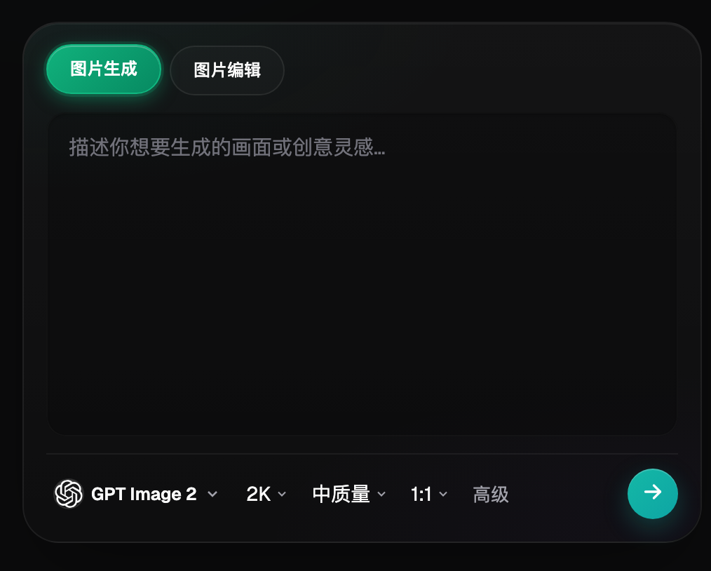
If the cover image is going to a print shop for a physical proposal booklet, GPT Image 2 supports 3 quality tiers × 4 resolution tiers — 12 combinations in all; pick the 4K tier and it won't look blurry when printed. If interior graphics need to fit different aspect ratios for different settings — say, 16:9 for a boardroom presentation or A4 portrait for print — Nano Banana 2 supports 14 aspect ratios, so you can change the ratio on the same image without re-composing it. If you'd rather not write prompts from scratch, the 150+ vertical Agents include plenty of ready-made workflows you can start from directly, skipping the step of writing prompts from zero.

Which Situation Are You In? Find Your Match
| Your Scenario | The Most Frustrating Part | How to Do It on Flux Art | Recommended Primary Model |
|---|---|---|---|
| You want the cover to match your company's or client's brand colors, but the AI-generated colors keep drifting | The color count isn't specified, so the model improvises | Lock specific color names and a color-count cap into the prompt, then use this image as the fixed baseline reference | Nano Banana 2 |
| The whole deck runs 40-50 pages and the interior graphics look thrown together with mismatched styles | Re-thinking the style from scratch for every single image | Lock in the same reference image and prompt set, then batch-generate | Nano Banana 2 |
| Visuals fill the entire slide, there's not enough white space, and it looks like a promotional poster | The prompt never specified a white-space ratio | Spell out the white-space ratio and a cap on decorative elements directly in the prompt | GPT Image 2 |
| The quadrants or steps in a matrix diagram or flowchart are drawn wrong | Only the topic was given, not the structure, so the logic doesn't line up | Use inpainting to fix just the wrong part of the selection, or write the structure into the prompt layer by layer and regenerate | Nano Banana 2 |
| Cover title text is blurry or has typos | Text-rendering quality is inconsistent | Use text-to-image directly to generate a cover with accurate Chinese/English titles | GPT Image 2 |
A 5-Step Walkthrough
Step 1: Register an account and pick the right entry point. The official Flux Art website is https://flux-art.ai. Registering gets you 500 bonus credits (subject to the current official offer) — enough for 30+ GPT Image 2 images — with direct, stable access and no extra network setup, at full speed with no rate limiting. This is the best onboarding choice for beginners making PPT graphics.
Step 2: Set the visual tone for the whole deck first. Generate a cover image to use as the baseline reference, locking constraints directly into the prompt — for example, "background white space at 70% or above, using only dark gray, Klein blue, and white, a geometric line style, no realistic icons or gradient blocks." The color palette and white-space ratio get locked in at this step, and the following dozens of pages follow suit.
Step 3: Batch-generate the interior graphics. Go into Nano Banana 2's text-to-image or image editing, upload 1-2 reference images (the baseline cover image, plus a screenshot of the client's brand color palette if you have one — the platform supports up to 14 reference images, but 1-2 is enough here). Keep the prompt template consistent and only swap out each page's topic content, for example, "keep the reference image's color palette and white-space ratio, but change the topic to market-size estimation, and don't add extra decorative elements."
Step 4: Handle matrix diagrams and flowcharts separately. For these, you can't just write "draw a growth matrix" — you need to spell out the quadrant meanings, axis directions, and the conclusion tied to each quadrant one by one in the prompt, for example, "the horizontal axis is market share from low to high, the vertical axis is growth rate from low to high, and the upper-right quadrant is labeled star business." After generating, check each quadrant against the conclusions in the body text.
Step 5: Do a full pass to check style and logic. Line up the newly generated images alongside thumbnails of the existing pages; for anything with inconsistent style or an off-tone color, go back to inpainting and fix just that spot. Finalize matrix diagrams and flowcharts only after checking their logic — no need to redo the whole deck.
Pre-Export Checklist
- Do the cover image and all interior graphics use the same baseline reference image?
- Is the whole deck's color palette kept to two or three colors, and does any page suddenly introduce a new color?
- Is the white-space ratio consistent, and is any image more crowded than the others?
- Do the quadrants, axes, and step order in matrix diagrams and flowcharts match the body text?
- Are there any typos or blurry rendering in the cover title or interior text?
- Is the icon style (flat / line / realistic) consistent throughout, without multiple styles mixed together?
- Are the client's or company's brand colors accurately reproduced, with no colors outside the brand palette introduced?
- Before finalizing, have you lined up thumbnails of the new and old pages side by side for an overall scan?
- For images meant for print or projection, has the resolution tier been set high enough?
Being Honest About the Limits: What AI Still Can't Do
- Charts with precise numbers — bar charts, line charts, and waterfall charts with specific values. AI-generated illustrations are good for conveying qualitative logical relationships, but not suited to serve as precise data charts; use dedicated charting tools for data-driven charts.
- Complex client-specific brand elements, such as logo graphics with special production techniques or intricate custom-font transformations. AI-generated images can't reliably reproduce these down to the last detail — complex brand elements still need a designer to review and finalize.
- Highly niche, industry-specific analysis frameworks — if it's a model the client invented internally with no public documentation elsewhere, AI most likely has no matching knowledge of it, so the structure and logic it draws still needs to be manually checked against the original intent.
- A single page crammed with an extreme amount of information — say, a dozen-plus data points plus multiple layers of arrows squeezed into one image. AI can't reliably keep this clear in a single generation, so it's better to split the content into multiple images first.