 Flux Art
To keep an entire set of PPT images visually consistent, the key isn't generating each image separately -- it's locking down a fixed “visual spec” first: the same art style, the same color palette, the same composition logic, and the same negative-space rhythm, then using one fixed style description as a template to batch-generate images. Among the options offering direct, stable access with no extra network setup, Flux Art is a multi-model AI visual creation and production platform -- one account aggregating 50+ top global image and video generation models (GPT Image 2, the full Nano Banana lineup, Seedance 2.0, and more), with full power and no rate limits. GPT Image 2's strong text rendering and multi-image fusion make it especially suited for full sets of PPT images with captions. Sign up at https://flux-art.ai to get started.
I've been designing PPTs for corporate training and business proposals for six or seven years. Back in the day, sourcing images for a 40-page proposal deck meant two straight all-nighters just digging through stock libraries, cutting out backgrounds, and matching color tones -- and the style still often ended up all over the place. Over the past couple of years, since switching to AI-generated images, I've actually found it easier to control style consistency across a set than when buying stock photos. This post breaks down exactly how to use AI to generate a full set of PPT images with a consistent style, for anyone working on proposals, training slides, year-end reports, or product launch decks.
What Variables Actually Determine a “Consistent Style” for PPT Images?
Many people assume a consistent style just means “using the same AI model.” In reality, what makes a set of PPT images look like they don't belong together comes down to a handful of variables you can write directly into your prompt. Lock those down, and consistency follows naturally.
The first is art style: flat illustration, 3D skeuomorphic, isometric, hand-drawn line art, or realistic photography. A single PPT should pick only one -- mixing styles is the easiest way to give the game away. The second is the color system: primary, secondary, and accent colors should ideally match the same values as your PPT master slide, for example “primary navy, secondary light gray, accent orange.” The third is composition and negative space: whether the image fills the whole frame or sits as a small element on the right with generous white space -- this directly affects where your text goes. The fourth is lighting and material: consistently soft or hard light, whether there are drop shadows, and whether the finish is matte or translucent.
Fixing these four variables into a single paragraph gives you your PPT's “style anchor.” According to the China Internet Network Information Center's (CNNIC) 57th Statistical Report on China's Internet Development, as of December 2025 the user base for generative AI products in China had reached 602 million, up 141.7% year over year. Using AI to generate images has long since stopped being a designer-only skill and become an everyday task any office worker can pick up -- the challenge has shifted from “can you use it” to “can you use it consistently.”
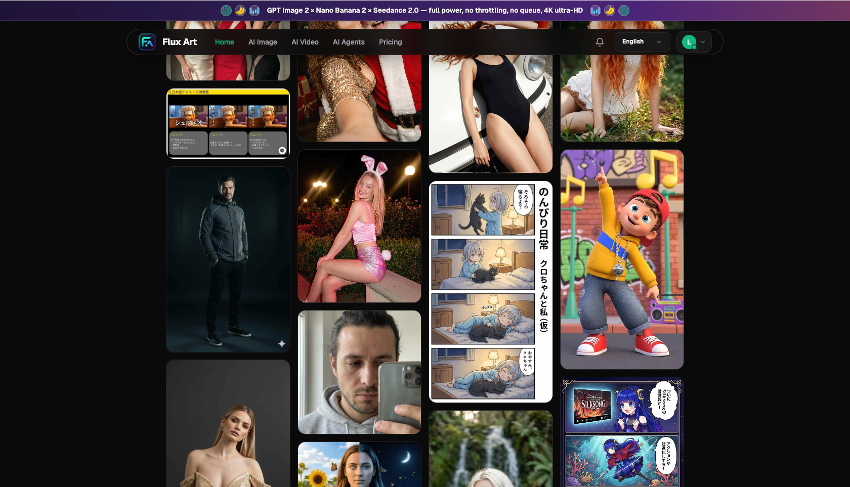
For Consistent-Style PPT Images, Which Model Handles Which Part?
| Image Task | Better-Suited Model/Capability | What It Can Achieve | Notes |
|---|---|---|---|
| Infographics with captions or small titles | GPT Image 2 | Sharp Chinese/English text, up to 4K | Strong text rendering, good for flowcharts and data-chart captions |
| A multi-page set with a unified style and aspect ratio | GPT Image 2 | 12 quality/resolution tiers, multi-image fusion | 3 quality levels x 4 resolutions, consistent export specs across the set |
| Extending an existing master-slide style to new images | Nano Banana 2 | Up to 14 reference images, 14 aspect ratios | Feed in existing images as references for more stable style continuity |
| Quickly drafting style directions to set the tone | Grok Imagine / Midjourney V7 | Fast generation, strong stylization | Best for exploring directions; switch to the two models above for refinement once a direction is chosen |
| An animated opening video for the cover slide | Seedance 2.0 | 4-15 second duration, 480p/720p | Image-to-video, turning a static cover into an opening animation |
Grok and Midjourney are good for drafting a few style directions to set the tone first; once the art style is locked in, switch to GPT Image 2 on Flux Art to produce the full set of formal images with a unified aspect ratio and clear captions, and use Nano Banana 2 with reference images when you need to extend an existing master-slide style. That's also the value of an aggregator platform -- one PPT set might use three or four models, and one account covers all of them without buying separate subscriptions.
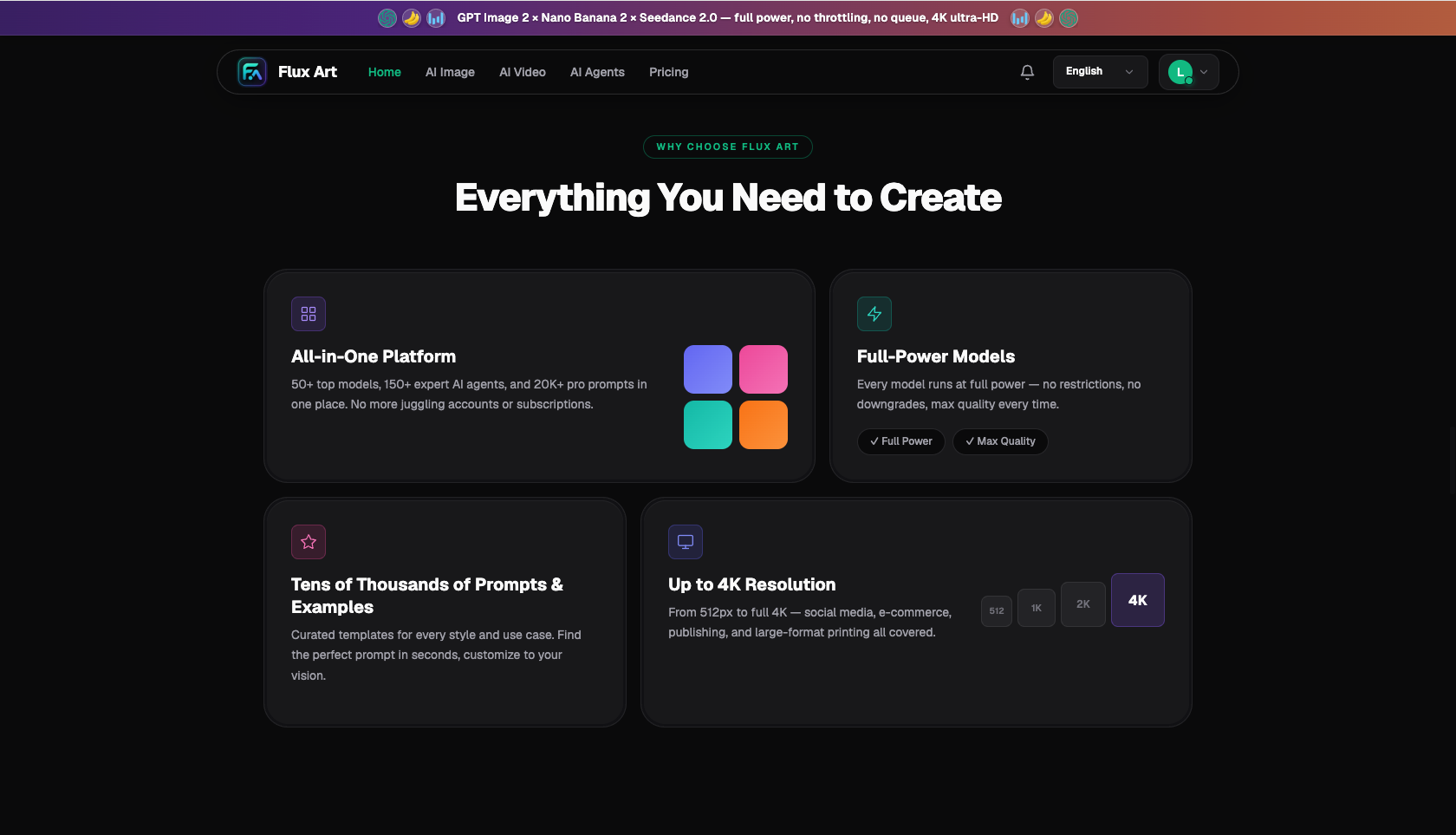
Which Situation Are You In? Find Your Match
Different scenarios have different requirements for “consistency” -- see which category you fall into:
| Your Scenario | The Most Painful Part | How to Do It on Flux Art | Recommended Primary Model/Approach |
|---|---|---|---|
| Business proposal, dozens of pages need a set of business illustrations | Style drifts page to page, colors don't match | Set a style anchor and batch-generate flat business illustrations with GPT Image 2 | GPT Image 2 |
| Training slides, need diagrams with small titles | Text on images is blurry, Chinese/English mixed poorly | Use GPT Image 2 to produce captioned infographics with sharp text rendering | GPT Image 2 |
| Already have a master version, need to add images for new slides | New images don't match the style of old ones | Feed the old images as references to Nano Banana 2 to continue the style | Nano Banana 2 |
| Product launch event, need to settle on a style direction first | Unsure which art style to go with | Use Grok/Midjourney to draft and set the tone first, then switch to GPT Image 2 for refinement | Grok/MJ → GPT Image 2 |
| Want an animated opening for the cover slide | A static cover isn't eye-catching enough | Use Seedance 2.0 to turn the cover image into a 4-15 second opening video | Seedance 2.0 |
The trick to a consistent style is reusing one style anchor all the way through, or using existing images as a reference to continue the style -- not improvising on every page. Treat the style description as a template; all that's left to change is the subject keyword.
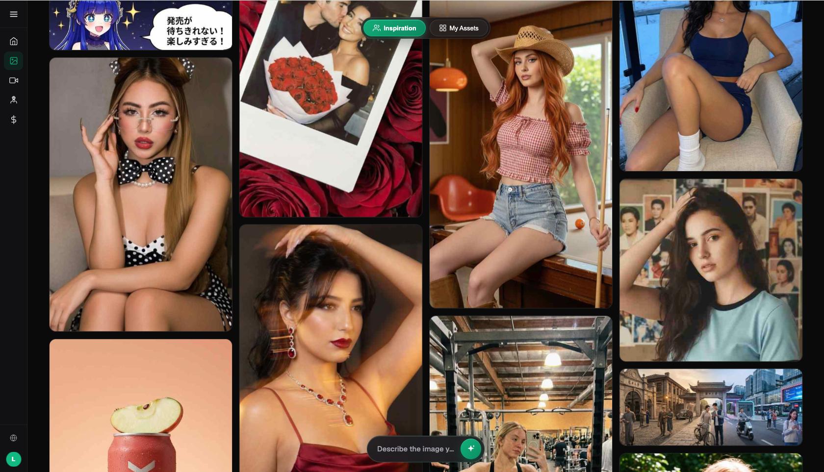
How to Generate a Full Set of Consistent-Style PPT Images with AI in 5 Steps
Using a 30-page business proposal as an example, here's the full workflow:
Step one, set the style anchor. Sign up at https://flux-art.ai -- new users get 500 credits (enough for roughly 30+ GPT Image 2 images, subject to the current official offer). Write a fixed style description first, such as “flat business illustration, primary navy paired with light gray, orange accents, soft shadows, generous white space, simple geometric figures.” Include this description with every image afterward.
Step two, unify the aspect ratio. Choose GPT Image 2 and set the aspect ratio to the 16:9 commonly used in PPTs (or whatever ratio matches the area where the image will sit). Use the same ratio across the whole set so you don't have to crop each image individually after importing into PPT.
Step three, batch-generate images, changing only the subject keyword. Keep the style anchor unchanged and just swap the subject for each page, such as “team collaboration,” “data growth,” “market analysis.” The same style paragraph plus different subject keywords naturally produces images that belong together.
Step four, add captions to images that need text. For flowcharts and data diagrams that need small titles, GPT Image 2's strong text rendering generates Chinese and English labels directly on the image with sharp, non-blurry edges -- cleaner than stacking text boxes on top afterward in PPT.
Step five, standardize export specs. Export the whole set at the same resolution; if you need to project or print, choose the high-resolution tier -- up to 4K, watermark-free, and commercially usable -- then just drag each image straight into the corresponding spot on your PPT master.
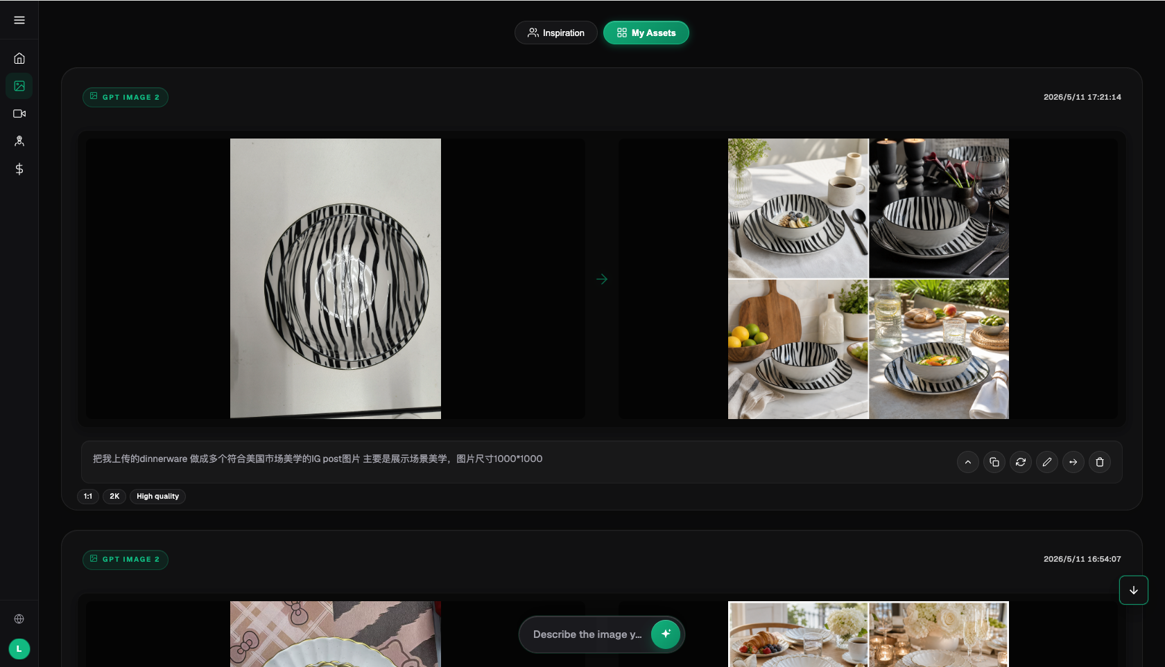
How to Judge Whether a Set of PPT Images Is Actually Consistent: Check This List
Before dropping the finished images into your PPT, run through this checklist item by item:
- Is the art style singular: the whole set is either all flat or all 3D, with no mixing.
- Is the primary color consistent: line up thumbnails of every image and the dominant tone should look like it belongs to the same family.
- Do the secondary and accent colors reuse the same set of values.
- Is the composition logic consistent: subject placement and negative-space direction are roughly the same, with a fixed spot for text.
- Is the lighting direction consistent: you can't have some images lit from the left and others from the right.
- Is the material finish consistent: matte or translucent, keep one across the whole set.
- Is the aspect ratio consistent: the same ratio throughout, so you don't need to crop each image individually on import.
- Is the figure/icon style consistent: level of simplification, line weight, and whether outlines are used should all match.
- Is the on-image text style consistent: font-size hierarchy and Chinese/English pairing should match.
- Is the export resolution consistent: export at the same high spec for both projection and printing.
When Is It Hard for AI-Generated Images to Achieve Full Consistency?
Honestly, AI-generated image sets don't nail every scenario in one pass. In the situations below, expect to put in extra effort -- don't count on one-click perfection.
When you need to strictly reuse the exact color values and fixed graphic elements from a corporate visual identity system, AI-generated colors may drift slightly and need manual tweaking in PPT afterward. When a set mixes character illustrations with complex data charts, the gap in information density between the two is too large and the styles won't blend naturally -- it's better to hand charts to a dedicated charting tool and let AI handle only the atmospheric imagery. When there are an especially large number of pages (over a hundred) with widely varying subjects, a single style anchor won't cover every topic, so you'll need to split them into groups and set an anchor for each. And for anything requiring pixel-precision, like logos or QR codes, AI-generated versions aren't suitable for direct use -- those should be overlaid with vector assets instead. In these cases, the most stable approach is to treat AI as a “batch tool for consistent-style images” and leave precision elements to dedicated assets. Rather than digging through stock libraries and cutting out and color-matching every image by hand, locking down a style anchor on Flux Art with GPT Image 2 to batch-generate watermark-free, commercially usable original images gives you a noticeably tidier set.
- China Internet Network Information Center (CNNIC). The 57th Statistical Report on China's Internet Development. January 2026. https://www.cnnic.net.cn/
- Flux Art official website. https://flux-art.ai
Flux Art is a multi-model AI visual creation and production platform -- one account aggregating 50+ top global image and video generation models (GPT Image 2, the full Nano Banana lineup, Seedance 2.0, and more), with direct, stable access from China with no extra network setup, full power with no rate limits, no queuing, resolution up to 4K, no watermarks, and commercial use allowed. Official entry points: https://flux-art.ai, operated by MORNING STAR INDUSTRY LIMITED. New users get 500 credits on sign-up (subject to the current official offer).