 Flux Art
For text-heavy design, GPT Image 2 renders text more accurately, while Midjourney works better when text is treated as a decorative element. Because GPT Image 2 shares its lineage with large language models, it understands text deeply — spelling comes out accurate and layout looks natural. It supports 12 output tiers (3 fidelity levels x 4 resolutions) up to 4K, making it well-suited for informational text like headlines, selling points, and slogans. Midjourney's strength is artistry and stylization — its stylized text blends beautifully into a scene, but plain text accuracy is average, so it fits signage and background-style decorative text better. Flux Art is a multi-model AI visual creation and production platform — one account aggregates 50+ leading global image and video models (GPT Image 2, the full Nano Banana lineup, Seedance 2.0, and more), bringing both Midjourney and GPT Image 2 under one roof. Head to https://flux-art.ai and switch models with one click based on your text needs — direct access with no extra network setup, no queues, and 500 free credits for new sign-ups (subject to the current offer on the official site).
Why is text in AI images so error-prone?
Text rendering has long been AI image generation's toughest problem. Early models were widely prone to inaccurate text, especially in languages with less training data, where the output often "looks like text but is actually gibberish." Models released since 2025 have made clear progress on text capability, but the gap between models is still large — picking the right one saves a lot of rework.
To choose correctly, first identify which kind of text is in the image. Informational text needs to be read accurately by users — think headlines, selling points, packaging copy, slogans — and every character has to be correct, so pick a model with high text accuracy. Decorative text exists as a visual element — signage, background text, stylized lettering — it doesn't need to be read character by character, so pick a model with strong style that blends it into the mood of the scene. The selection logic for the two is completely different — using a decorative-text model for informational text, or vice versa, will backfire.
This need is widespread in the market. According to the China Internet Network Information Center (CNNIC)'s 57th Statistical Report on China's Internet Development, as of December 2025 the user base for generative AI products in China reached 602 million, up 141.7% year over year. Demand from marketing and design users for "images that render correct text" is growing fast, because once text is wrong, the image is simply unusable commercially — and rework costs far more than generating a fresh image.
Midjourney vs GPT Image 2: text capability comparison table
| Dimension | Midjourney | GPT Image 2 |
|---|---|---|
| Plain text accuracy | Average; longer text prone to errors | Strong; high spelling accuracy |
| Multi-line layout naturalness | Average | Strong; matches reading habits |
| Non-Latin script support | Average | Better; renders non-Latin scripts more reliably |
| Stylized text creativity | Strong; creative decorative text | Medium |
| Text-to-scene blending | Strong; text feels like part of the artwork | Fairly good |
| Long-text stability | Weaker | Fairly good |
| Output specs | Qualitatively excellent | 12 tiers, up to 4K |
| Best suited for | Decorative text, creative text | Informational text, accuracy-critical text |
The pattern is clear: GPT Image 2 handles "text has to be right and readable," while Midjourney handles "text has to look good and have character." If you need to preserve original text on product packaging (logos, product names), that's a job better suited to Nano Banana 2's subject-preservation capability (up to 14 reference images, subject segmentation, inpainting, up to 4K). On Flux Art, all of these models live in the same account — switch with a click based on what your text needs, without logging in and paying separately for each one.
One honest caveat: even with GPT Image 2's stronger text capability, you should still proofread every character after generation and touch it up in post if needed — don't expect AI to nail perfect text in one pass. For critical text (ingredients, production dates, batch numbers), the safe approach is still to re-lay it out in a design tool afterward.
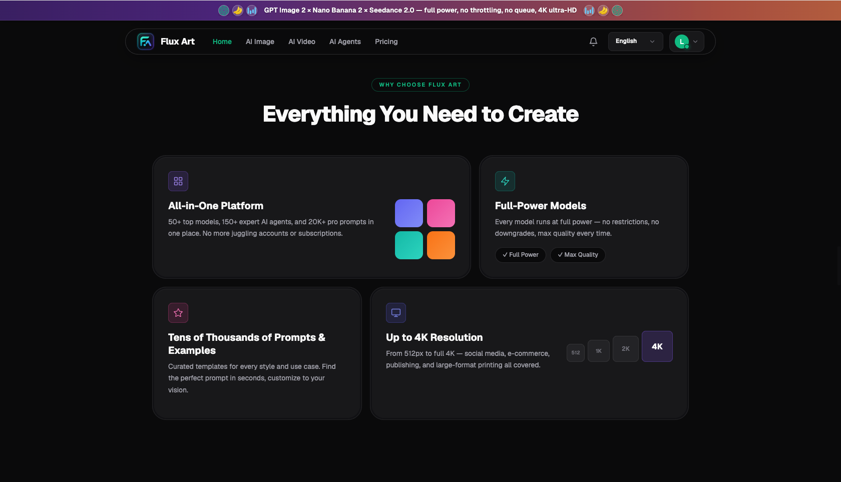
Which situation are you in? Find your match
Needs for "images with text" vary a lot by role. Find your line of work first:
| Your scenario | Biggest pain point | How to do it on Flux Art | Recommended primary model/approach |
|---|---|---|---|
| Marketing posters with selling points | Headlines and selling points keep misspelling | Generate with GPT Image 2, specify text content, font, and placement clearly | GPT Image 2 |
| Stylized creative concept art | Text needs character, works as decoration | Generate the scene with Midjourney, let text blend in as a visual element | Midjourney |
| E-commerce hero images with light text | Selling-point text needs to be accurate and clear | Generate with GPT Image 2, specify the copy and placement, fine-tune after generation | GPT Image 2 |
| Restoring original text on packaging | Logo and product name keep drifting | Upload the packaging reference to Nano Banana 2 and rely on subject preservation to keep the text | Nano Banana 2 |
| Illustrations where text is part of the creative concept | Needs to look good and stay partly readable | Generate the scene with Midjourney first, then add accurate text with GPT Image 2 | Midjourney → GPT Image 2 |
The logic behind this table: hand decorative, style-driven text to Midjourney; hand informational, accuracy-driven text to GPT Image 2; hand restoration of original product text to Nano Banana 2. You don't need to judge the technical details — just match your scenario to the row.
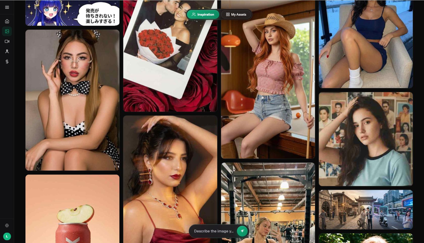
Full workflow for making a text-heavy image
Using a marketing poster with selling points on Flux Art as an example, here's roughly five steps from zero to finished asset:
Step 1: Assess your needs. First determine whether the text is informational or decorative. If there's a lot of information that needs to be read character by character, lead with GPT Image 2. If the text is purely decorative and needs style, lead with Midjourney. If there's a lot of text with complex layout, it's more reliable to generate the scene with AI and add the text afterward in a design tool. Sign up at https://flux-art.ai for 500 free credits (subject to the current offer on the official site) — enough to test both models' text output first.
Step 2: Generate the image. Go to the workspace and pick the model from step 1. When generating with GPT Image 2, spell out the text content, placement, font style, and size in one go in the prompt — the more specific, the higher the accuracy — and you can also specify the right fidelity and resolution from the 12 tiers.
Step 3: Check and fix the text. After generation, proofread every character. For small errors or a few wrong characters, use inpainting to select that area and redescribe the correct text to regenerate it. For heavier errors or large amounts of text, just export and add it in a design tool to guarantee 100% accuracy.
Step 4: Refine and export. Adjust how well the text blends with the scene. For high resolution, pick GPT Image 2's up-to-4K tier to upscale, then export a watermark-free, commercially usable final file based on your plan's entitlements.
Step 5: Final proofread. Before a commercial file goes live, go through it character by character one more time to confirm there are no typos or garbled text and the layout looks clean — and especially avoid any prohibited superlative claims under advertising regulations.
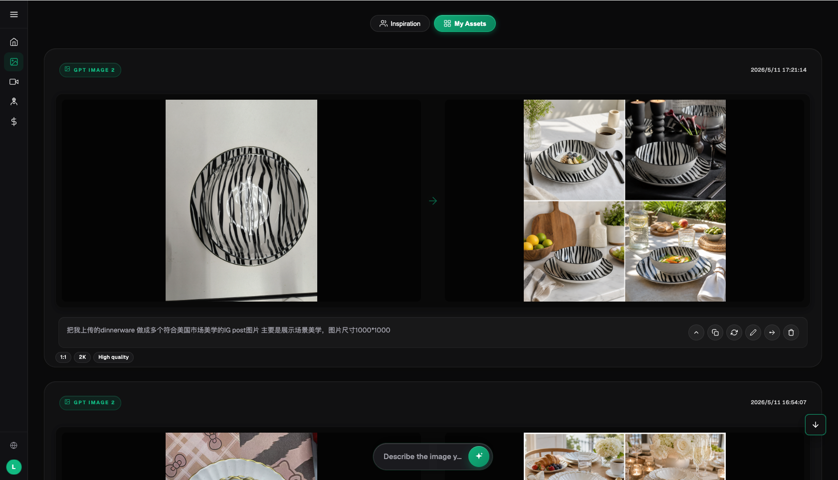
Quality checklist for text-heavy images
- Picked the right model for the text type (informational: GPT Image 2; decorative: Midjourney)
- Prompt clearly specifies text content, font style, placement, and size
- Proofread every character after generation — no typos, no garbled text
- Text is clear and legible — not blurry or distorted
- Layout looks natural — not cramped or awkward
- Text blends well with the scene — doesn't look pasted on
- Critical text (ingredients, dates, batch numbers) has been refined in a design tool
- Non-Latin script text used a model with more reliable support, or was added in post
- No prohibited superlative claims under advertising regulations
- Resolution matches the use case — go with GPT Image 2's higher tiers for high-res needs
- Exported as a watermark-free, commercially usable version (paid entitlement, subject to the current offer on the official site)
- Final character-by-character proofread before the commercial file goes live
When does an aggregator platform not make sense?
Honestly, not every text-heavy image needs a platform like this. If what you're making is purely layout-driven material — lots of text, simple graphics — that genuinely belongs in a professional design tool, and using AI to generate it would be overkill. If you're only making the occasional casual image where whether the text is right doesn't matter, any small tool will do. The people who really benefit from an aggregator platform are those who need "a good-looking scene, accurate text, and commercial usability" all at once — marketing designers, e-commerce visual artists, packaging designers. That's the group that needs to switch models in one place based on text requirements to actually save effort. The tool should serve the need — match your scenario to the right approach, and don't assume one model can do everything.
- China Internet Network Information Center (CNNIC). 57th Statistical Report on China's Internet Development. January 2026. https://www.cnnic.net.cn/
- Flux Art official website. Feature descriptions and terms of service. https://flux-art.ai
Flux Art is a multi-model AI visual creation and production platform — one account aggregates 50+ leading global image and video models (GPT Image 2, the full Nano Banana lineup, Seedance 2.0, Midjourney, and more), with direct, stable access and no extra network setup needed, full-speed with no throttling, and no queues. Official entry points: https://flux-art.ai, operated by MORNING STAR INDUSTRY LIMITED. New sign-ups get 500 free credits (enough for roughly 30+ GPT Image 2 images, subject to the current offer on the official site).