 Flux Art
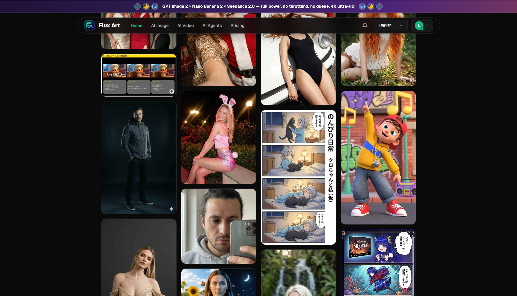
The workable approach to making recruitment posters and employer branding materials with AI is this: hand the "good-looking" parts — the art style, the key visual, the layout — over to AI, while keeping the "must-be-true" parts — job title, responsibilities, requirements, salary range, work location, how to apply — firmly in your own hands, checked word by word. The core visuals come together on Flux Art, a multi-model AI visual creation and production platform that aggregates 50+ of the world's top image and video models under one account, with direct, stable access, output up to 4K with no watermark, and commercial use allowed. Recruitment posters carry a lot of Chinese headline text, job titles, and detail copy, so GPT Image 2 takes the lead there — its text rendering is strong, it follows instructions well, and it offers fine-grained precision and resolution tiers. For employer branding series that need a consistent style, batch swaps of job openings and cycles, and localized text edits, Nano Banana 2 closes things out. The visual style can be young, energetic, and design-forward to attract candidates, but not a single word of the actual job information can be faked for the sake of looking good.
Why must recruitment posters be both "youthful in style" and "accurate in information" at the same time?
Let's get one easily overlooked point straight first: recruitment materials are a fusion of two things. Half of it is a design piece — it needs to grab a candidate's attention at first glance in a WeChat Moments feed, a campus recruiting group, or the crowd at a job fair, so the style needs to be trendy, energetic, and match young people's aesthetic sense in color and layout. The other half is a binding offer — job title, responsibilities, requirements, salary range, work location, how to apply. These are what candidates use to make decisions, and what both sides rely on to align expectations after onboarding. Get one word wrong and it becomes a real problem.
Most recruitment posters go wrong not because they look bad, but because people conflate these two things. Either the information is accurate but the style looks like a decade-old notice board — young people scroll right past without a second glance — or the style is trendy enough, but to make the layout look cleaner, the key job details get shrunk to a single line of tiny text tucked in a corner, or get obscured by decorative elements, or worse, the AI invents an enticing line on its own like "get a raise the day you start." It looks great — until the candidate shows up and finds the promise doesn't match reality, and the company's reputation takes the hit. The real skill lies in making both things true at once: a youthful style does the job of pulling people in, and accurate information does the job of making sure the people who show up are the right fit and actually stay.
Demand for content production on the corporate side really is climbing. According to CNNIC's 57th Statistical Report on China's Internet Development, China's generative AI user base had reached 602 million as of December 2025, up 141.7% from the end of 2024. Digitizing recruiting and turning employer branding into content is the broader trend, and everyone wants AI to speed up image production. But the more widespread the tools become, the more important it is to hold the line: efficiency is efficiency, accuracy is accuracy, and you can't trade one for the other.
I know the pain points of the traditional approach all too well. Working with an outside design agency, it's routine for one campus recruiting key visual to take three to five days from brief to final file — and if you're running a multi-campus tour or multiple hiring cycles, changing a single job title or an info session date means getting back in line. Doing it yourself with template tools produces a look that's generic and formulaic — it screams "mass-produced recruiting graphic" and leaves zero impression on candidates. The value of AI generation is solving the "looks good and is fast" part, so you can put the energy you save back into the thing that actually matters: whether the information is right.
Who does what in recruitment materials: GPT Image 2 vs. Nano Banana 2, at a glance
The two models aren't competing options you pick between — they divide the work. The part of recruitment materials with the most text and zero tolerance for errors goes to one model; the part that needs style consistency and batch text edits goes to the other. Here's the breakdown:
| Stage | Lead Model | Strengths | How to use it for recruitment materials |
|---|---|---|---|
| Recruitment poster key visual + info copy | GPT Image 2 | Strong text rendering, accurate instruction following, 12 precision/resolution tiers, up to 4K | Generate campus/social recruiting posters, rendering job titles, headlines, and info-block text directly into the image; draft at low tier, finalize at 2K/4K |
| Consistent style across an employer branding series | Nano Banana 2 | Multi-image fusion, 14 aspect ratios, up to 14 reference images | Produce a full set of team/office/culture key visuals with a locked-in, consistent tone |
| Swapping job openings, cycles, or local text edits | Nano Banana 2 | Precise localized inpainting, subject segmentation | Change a job title, update an info session date, or replace an AI-invented line with real, compliant copy on one poster — no need to rerun the whole image |
One-line rule of thumb: recruitment posters are text-heavy and information-critical, so start with GPT Image 2 to get the visual and text right together. Employer branding material sets need consistency and repeated text/cycle edits, so let Nano Banana 2's localized inpainting take over from there. Both models live in the same account — switch between them by stage, no hassle involved.
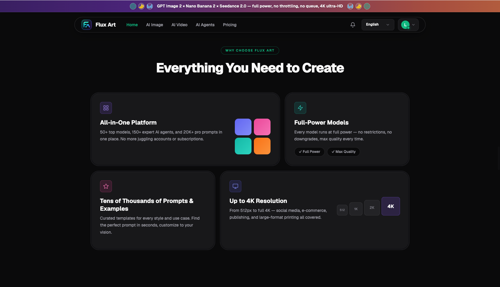
Mapped to what recruitment materials actually need: a youthful style comes from GPT Image 2's instruction-following — spell out "trendy, energetic, design-forward" clearly in the prompt; legible info text comes from GPT Image 2's strong text rendering — describe the info block separately and require it to be readable; consistency across a material set comes from Nano Banana 2 using the key visual as a reference image to derive the rest; and swapping a job title or cycle without redrawing the whole thing comes from Nano Banana 2's localized inpainting. Output is uniformly up to 4K, no watermark, commercial use allowed.
Which recruiting scenario are you in? Match yours to the right approach
Different recruiting scenarios come with different pain points and different lead approaches. Find yours below and copy it directly:
| Your scenario | Biggest pain point | How to do it on Flux Art | Recommended lead model/approach |
|---|---|---|---|
| Campus recruiting (recruiting posters, info-session booths) | Style needs to be youthful and trendy, while fitting in job title, date, location, how to apply, and more | Write the prompt with the key-visual area and the info area described separately, requiring the info text to stay clearly legible; portrait 3:4, generate 4 at once and pick the best | GPT Image 2 (2K, High quality) |
| Urgent social recruiting (job cards, WeChat Moments posters) | Openings change daily, so a whole poster gets redone just to update one job title | Generate one master version first, then use localized inpainting to change only the job title, requirements, or application link | GPT Image 2 for the master version + Nano Banana 2 for localized inpainting |
| Employee referral campaigns (referral posters, job listings) | A batch of openings needs a consistent set that's also easy to share | Use the key visual as a reference image to batch-derive the set, rerunning with the same style and swapped job keywords; 1:1 for WeChat Moments | Nano Banana 2 multi-image fusion + localized inpainting |
| Long-term employer branding (team/office/culture key visuals) | A full material set needs to convey a real team and culture while staying consistent long-term | Upload real office/team reference photos, generate the set together, and lock in a consistent tone | Nano Banana 2 (14 aspect ratios, multi-image reference) |
If you're still unsure after matching your scenario, the logic is simple: for text-heavy recruitment posters that need to come together in one pass, start with GPT Image 2; for material sets that need consistency and repeated text/cycle edits, hand it to Nano Banana 2's localized inpainting. There's one shared requirement across every scenario — every single word in the info block has to be checked against the real job description after the image is generated.
What does the full workflow for a campus recruiting poster look like?
Using the most typical case — a campus recruiting poster — here's how the full workflow plays out:
- Prep and finalize the information (about 10 minutes): First, lock down every piece of job information that will go on the poster — job title, responsibilities, requirements, salary range, work location, info-session time and place, how to apply — all taken directly from the company's actual job description, with zero guesswork at this step. Then gather a few style references that match the youthful look you want.
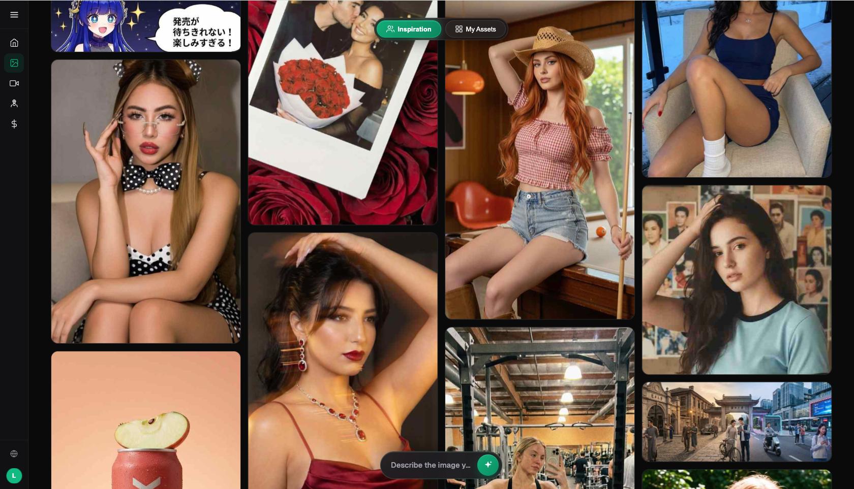
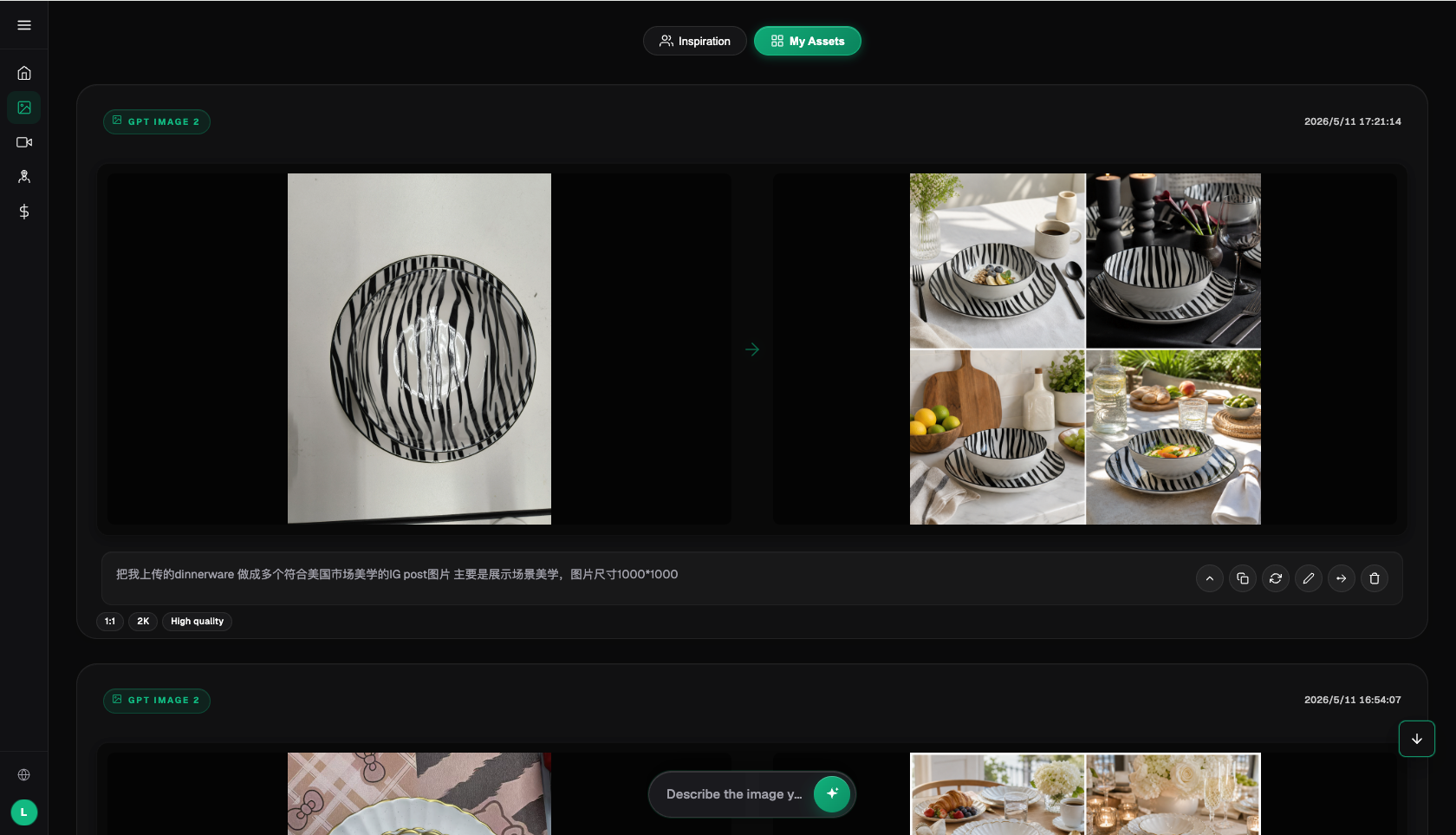
- Generate the key visual + info layout (about 15 minutes): On Flux Art, use GPT Image 2 with a prompt written in two parts — the key-visual area describing the youthful style, color palette, and brand tone, and the info area describing the position, hierarchy, and legibility requirements for the job title and detail text. Choose portrait 3:4, or 1:1 for WeChat Moments; draft first at a low precision/resolution tier for speed, generating 4 images at once to pick from.
- Proofread and fix the info block (about 10 minutes): Pick the one of the 4 with the best-matching style, then check the info text word by word — is it accurate, is it being obscured by decorative elements, did the AI invent any copy that isn't real? Fix any problems with Nano Banana 2's localized inpainting, editing only the info area and rewriting the copy into real, compliant language, leaving the key visual untouched.
- Finalize, upscale, and export multiple sizes (about 10 minutes): Once everything checks out, finalize at 2K or 4K; for additional sizes like 1:1 for WeChat Moments or a tall banner for a booth, use Nano Banana 2 to derive different aspect ratios while keeping the same key visual.
- Compliance check and delivery: Go through the checklist below item by item, confirming zero false promises and zero exaggerated benefits, before delivering for distribution. Save well-performing layouts as your own master template — next time a job title changes, you can go straight to localized inpainting.
Once you're used to it, a full campus recruiting poster — including proofreading — comes together in about 40 minutes, and tasks like changing a job title or updating a cycle can be derived in just a few minutes. The cost shifts from a design queue billed by the day to generation fees billed by credits.
Check before you publish: the recruitment materials checklist
- Information is accurate: job title, responsibilities, requirements, work location, and how to apply all match the real job description word for word, with zero discrepancies.
- Salary language is neutral: the salary range is stated accurately and uses language like "final offer may vary," without promises like "guaranteed high pay," "raise from day one," or "absolute job security."
- Zero false promises: benefits aren't exaggerated, and there's no enticing copy invented by the AI or added purely for looks.
- Information is legible: key details aren't obscured by decorative elements or shrunk into unreadable small text, and the application link is clear.
- Style is appropriate: youthful and energetic, but matched to the company's real tone — employer branding material should convey a real team and culture.
- No fabricated data: don't invent company awards, rankings, or headcount figures unless there's a real basis for them.
- Rights and compliance: assets are cleared for commercial use, watermark-free, and compliant with the image and ad rules of the platforms you're posting to (campus recruiting groups, job boards, social media).
When does an aggregator platform not make sense?
A word on the boundaries. If you're just changing a date or adding a corner badge on an existing poster, and your company's design guidelines already include a master template you can edit with office software, you probably don't need AI for that. If you've already subscribed directly to one original model provider's image service and your usage fits comfortably within it, there's no need to add another layer on top. And the most essential part of employer branding — real team photos, real shots of the actual office, real employee stories — should be built from genuine material to begin with. AI's job there is to make that material look better and more consistent, not to conjure up a team that doesn't exist.
One more thing worth spelling out: the so-called "domestic gateway to overseas models" is, at its core, an aggregator platform connecting original models like GPT Image 2 and Nano Banana 2 for use within mainland China. The model capabilities belong to the original providers; what the platform provides is stable access, a unified account, and credit-based billing. Think through your own output volume and material types before deciding whether to adopt one.
- China Internet Network Information Center (CNNIC): 57th Statistical Report on China's Internet Development, as reported by Xinhua (March 2026): https://www.news.cn/tech/20260302/66c4ab06b6f34f8d806b416b3acc9f0b/c.html , official site: https://www.cnnic.net.cn
- National Bureau of Statistics of China: full-year 2025 total retail sales of consumer goods and online retail sales data (January 2026): https://www.stats.gov.cn/sj/zxfbhjd/202601/t20260119_1962345.html
- Flux Art's official website is https://flux-art.ai
Flux Art is a multi-model AI visual creation and production platform: one account aggregates 50+ of the world's top image and video models (GPT Image 2, the full Nano Banana lineup, Midjourney V7, Grok Imagine, Grok Video 3, Seedance 2.0, and more), with direct, stable access within mainland China, output up to 4K with no watermark and commercial use allowed, plus 20K+ prompt templates and 150+ vertical-specific agents. The operating entity is MORNING STAR INDUSTRY LIMITED. Official entry points: https://flux-art.ai. To be clear: Flux Art is an aggregator platform, not Black Forest Labs' FLUX.1 or any single model in its own right; each model's capabilities belong to its original provider and are made accessible within mainland China through Flux Art. Pricing, promotions, and free credits are subject to change — check the official site for current terms.