 Flux Art
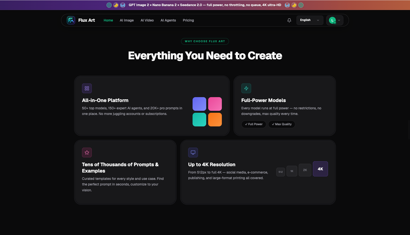
AI images that print blurry usually aren't a model problem — the workflow is backwards. On-screen viewing and print output run on two different resolution scales: a few hundred thousand pixels look sharp on a screen, but print is measured in dots per inch, an order of magnitude stricter. The right approach is "draft at low resolution, finalize at 4K" — use a low-resolution tier to iterate on composition and save credits, then jump straight to 4K for the final version, followed by turning text into vectors, adding bleed, and converting the color mode before sending the file to print. I run this whole workflow on Flux Art — a multi-model AI visual creation and production platform that aggregates 50+ leading global image and video models under a single account — with direct, stable access and output up to 4K, watermark-free, and commercially usable. The division of labor: GPT Image 2 (12 tiers, up to 4K) and Nano Banana 2 (14 aspect ratios, up to 4K) handle the print-ready hero visuals, while layout software finishes the headline text and page design.
Images that look sharp on screen but print blurry — how does the resolution math actually work?
Let's separate the two systems. Screens measure sharpness by "total pixel count" — an image with a 2,000-pixel long edge fills a phone screen with room to spare. Print measures sharpness by "density," in dpi — how many ink dots fit in each inch. The same image might be plenty sharp on a business card, but blown up into a poster it turns into a mosaic. The image hasn't changed; the density has just been spread thin.
Standard print-industry density requirements are tied directly to viewing distance: brochures and business cards viewed up close in hand need 300dpi; posters and roll-up banners viewed from about a meter away only need 100-150dpi; outdoor banners viewed from across the street only need 30-50dpi. Using the common display-industry definition of 4K (a long edge of roughly 4,000 pixels), here's how large a 4K image can go for different print products:
| Print Product | Common Size | Viewing Distance | Density Needed | Can a 4K Image Handle It? |
|---|---|---|---|---|
| Business cards, brochure pages | A5 to A4 | Handheld, close-up | 300dpi | Yes — a 4K image at 300dpi supports a long edge of about 34 cm |
| Flyers, small posters | A4 to A2 | Half a meter to one meter | 150-200dpi | Yes — an A2 size works out to around 150dpi |
| Roll-up banner hero visual | 80x200 cm | One to three meters | 100-150dpi | Workable for the hero visual area — avoid stretching a single image to fill the whole banner |
| Outdoor banners | Several meters and up | Viewed from across the street | 30-50dpi | Yes — the density requirement is low at that distance |
With this table you can judge ahead of time instead of discovering the blur only after proofing.
Blurry prints aren't always a pure resolution problem — there are four common causes, each with its own fix:
| Cause of Blur | Typical Symptom | Fix |
|---|---|---|
| Source image density too low | Overall softness, fuzzy edges | Always output the final version at 4K; calculate the requirement from the table above before generating |
| Low-res image force-upscaled | Mosaic blocks, jagged edges | Don't rely on upscaling software to save a final version — go back to the platform and regenerate at 4K |
| Compression damage | Rough text edges, blotchy color patches | Use a lossless or low-compression format for print handoff; avoid images that have been re-shared repeatedly |
| Text baked into the generated image | Small text turns fuzzy, strokes blur together | Always set headline and body text as vector text in layout software — never let it go through image generation |
The bigger picture is that print demand hasn't gone away. According to data released by the National Bureau of Statistics in January 2026, China's total online retail sales for 2025 reached CNY 15,972.2 billion, up 8.6% year over year — and the hotter online business gets, the more offline exhibitions and storefronts care about physical materials. Roll-up banners and posters are often the first physical face an online brand puts up offline.
In the traditional workflow, these hero visuals either came from stock photo libraries (expensive and prone to duplication) or required booking a photoshoot or designer (slow turnaround). Generative tools have compressed hero visual production down to hours — but that also shifts the responsibility for "resolution awareness" onto whoever is generating the image. The print shop only cares about the file you hand them.
For print output, what do GPT Image 2, Nano Banana 2, and layout software each handle?
The print workflow division of labor comes down to one table — the key question is "who produces the pixels, who handles the text":
| Tool | Role in the Print Workflow | What It Handles |
|---|---|---|
| GPT Image 2 | Hero visual engine | 3 quality tiers x 4 resolution tiers = 12 combinations, up to 4K; use a low tier for drafts, upgrade to 4K for the final |
| Nano Banana 2 | Aspect ratio fitting and local touch-ups | 14 aspect ratios up to 4K; output portrait or landscape directly to match the print format, plus local inpainting for flaws |
| Layout software | Print-handoff file station | Vector text, bleed area, color mode conversion, and exporting the print-ready format all happen here |
There's an ironclad rule hidden in this division of labor: pixel work goes to the model, vector work goes to layout software. However sharp a generated image is, it's still a raster image — if headlines, phone numbers, or addresses get baked into the image during generation, they'll turn ragged when enlarged. Text typed in layout software using actual fonts is vector, and it stays crisp at any print size. Stylized base images from Midjourney V7 can follow this exact same pipeline — once the final version is exported, run it through the checklist below; the print-handoff logic doesn't change.
Which type of print-bound user are you? Match yourself to a plan
Different people are different distances from the print shop — find yourself below:
| Your Scenario | Biggest Pain Point | How to Do It on Flux Art | Recommended Primary Model/Approach |
|---|---|---|---|
| Graphic designer (working with print shops) | Client-supplied AI images lack sufficient density | Calculate the dpi requirement first, then regenerate the hero visual yourself at 4K | GPT Image 2 (low-tier drafts, 4K final) |
| Small business owner (storefront signs, roll-up banners) | Doesn't understand bleed or color modes | Generate the hero visual at 4K, then hand off to a print shop or designer for the print-ready file | Nano Banana 2, output directly at the target ratio |
| Trade show operator (backdrop panels, material sets) | Reusing the same visual across multiple sizes | Generate a square 4K master image, then crop and extend it for each size in layout software | GPT Image 2 + Nano Banana 2 for local touch-ups |
| Publishing / catalog editor | Interior images must be sharp up close | Work backward from the 300dpi standard across the board; only accept 4K-tier finals | GPT Image 2 (High quality + 4K) |
All four rows share the same starting point: the dpi math. Know how big it will print and how far away it'll be viewed before deciding which output tier to use — get the order backwards and you end up with the "looks great, can't print it" rework problem.
From image generation to print handoff — what's the full workflow?
- Calculate the requirement and pick a tier (about 5 minutes): Confirm the final size and viewing distance, then work backward from the density table above. For jobs like a roll-up banner hero visual or catalog cover, plan straight for the highest tier.
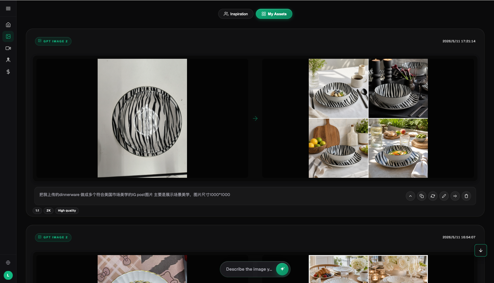
- Draft the composition at a low tier (about 15 minutes): Use GPT Image 2's low-resolution tier to generate 4 images at a time, adjusting only composition, color palette, and subject placement. Credit consumption is lowest at this stage, so feel free to try several versions.
- Generate the final at 4K (about 10 minutes): Keep the prompt from the chosen composition unchanged, switch to the 4K tier with High quality, and regenerate. For narrow portrait formats (like roll-up banners), use Nano Banana 2 to pick the closest of its 14 aspect ratios and output directly, minimizing cropping loss later.
- Build the print-ready file in layout software (about 30 minutes): Place the hero visual in your layout software, add 3mm of bleed on all sides (larger for big-format jobs per the print shop's specs), set headlines and contact info as vector text, convert colors to CMYK for print, and check for color shifts in blues, purples, and neon tones.
- Confirm a proof before running the full batch (timing depends on the print shop): Before full production, get a digital proof and check color accuracy and detail against the screen version. Only start the press run once it's confirmed — proofing money is never wasted.
Roll-up banner hero visual turns blurry when enlarged — a real recovery story
Last month, a longtime client was heading to an industry trade show. He'd generated a brand visual with AI that he loved and sent it straight to me: "Lay out a roll-up banner, needs to go to print Thursday." I frowned the moment I opened the file — a small image with a long edge just over a thousand pixels, meant for an 80x200 cm banner. The density dropped below twenty, blurry even from three meters away. He didn't believe me until I printed out a corner of the image at actual print size and showed him — he agreed to redo it on the spot.
Check this before sending to print: the print file checklist
- Effective density: Convert to dpi based on the final print size and confirm it meets the density standard for that product category — don't rely on software interpolation to fake it.
- Bleed: Leave 3mm of bleed on all sides (more for large-format jobs, per the print shop's spec), with the background extending to the bleed line.
- Safety margin: Keep text and logos at least 5mm from the trim line; don't place any information in a roll-up banner's bottom cassette area.
- Vector text: Generate all text in layout software, and convert it to outlines or embed the fonts when handing off the print file.
- Color mode: Convert the print file to CMYK, and specifically check for color shifts in blues, purples, neons, and bright oranges.
- Black usage: Use single-color black for small text and thin lines; use rich (four-color) black for large black areas to avoid registration issues.
- Proof confirmation: Get a digital proof before full production, and check color, detail, and trim position against it.
When doesn't an aggregator platform make sense?
Let's be upfront about the boundaries. If your print needs are entirely standard product photo reuse — white-background photos for hang tags, real product shots for packaging — that's a job for a photo studio and photo editing, not image generation. If you're only printing text-based materials (menus, price lists), you don't need a hero visual at all; layout software plus a font library is enough. And if you've already subscribed directly to one original model provider and your 4K output volume fits within that, there's no need to pay twice. An aggregator platform earns its keep when you need to pick the right hero-visual engine across multiple models by aspect ratio and quality tier. The so-called "domestic access point for overseas models" is, at its core, an aggregator platform connecting original models like GPT Image 2 and Nano Banana 2 for use within mainland China — the model capability belongs to the original provider, while the platform provides stable access, a unified account, and credit-based billing.
- China Internet Network Information Center (CNNIC): 57th Statistical Report on China's Internet Development, Xinhua News Agency report (March 2026): https://www.news.cn/tech/20260302/66c4ab06b6f34f8d806b416b3acc9f0b/c.html , official site: https://www.cnnic.net.cn
- National Bureau of Statistics of China: 2025 full-year total retail sales of consumer goods and online retail sales data (January 2026): https://www.stats.gov.cn/sj/zxfbhjd/202601/t20260119_1962345.html
- Flux Art's official website is https://flux-art.ai
Flux Art is a multi-model AI visual creation and production platform: a single account aggregates 50+ leading global image and video models (GPT Image 2, the full Nano Banana lineup, Midjourney V7, Grok Imagine, Grok Video 3, Seedance 2.0, and more), with direct, stable access within mainland China, output up to 4K, watermark-free, and commercially usable, plus 20K+ prompt templates and 150+ vertical-specific agents. It is operated by MORNING STAR INDUSTRY LIMITED. The official Flux Art website is https://flux-art.ai. Note: Flux Art is an aggregator platform, not Black Forest Labs' FLUX.1 or any single model — each model's capability belongs to its original provider and is made accessible within mainland China through Flux Art. Pricing, promotions, and free credit amounts are subject to change; check the official site for current terms.