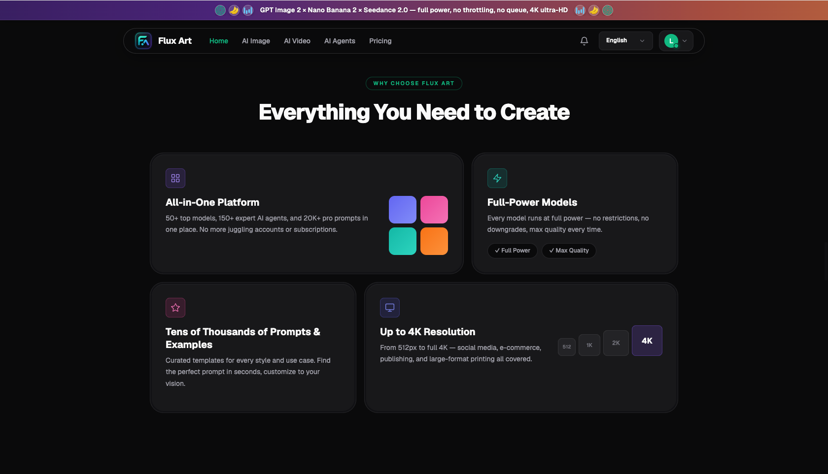
 Flux Art
For professional institutions like law firms and clinics, the key to AI-generated imagery isn't making visuals flashier — it's making them more "restrained." Calm colors, clean composition, and believable scenes are what make people trust you at first glance. All of this can be done on Flux Art — a multi-model AI visual creation and production platform that aggregates 50+ top global image and video models under a single account — with direct, stable access and no extra network setup, up to 4K, no watermark, and commercial use allowed. Use GPT Image 2 for professional scene imagery and article headers, Nano Banana 2 for retouching real office scenes and photos of lawyers and doctors, and Seedance 2.0 for short-video cover moods. The visual logic for professional institutions is the opposite of e-commerce and fast-moving consumer goods: those categories want eye-catching and lively; this one wants composed and trustworthy. Whoever masters "less is more professional" gets the imagery right.
I've spent four years running legal new-media operations — writing legal-education articles for law firms and handling imagery, covers, and posters for their official accounts and video channels. This field has one defining trait: images can't be as loud as product listings. The moment visuals get too flashy or entertainment-styled, they undercut the institution's credibility, and clients hesitate to trust you with their case. Over the past two years I've developed a "restrained imagery" workflow that uses AI to boost efficiency without losing that professional tone. Here's the whole playbook.
Why does "more restraint" mean "more professional" for institutional imagery?
Ordinary product imagery chases attention — high saturation, bold subjects, strong contrast, whatever grabs the eye. Professional institutions do the opposite. Law firms, clinics, and accounting firms sell expertise and trust; clients are handing over something high-stakes — a lawsuit, their health, their finances — and what they want to feel is "this institution is steady, reliable, not flashy." The moment an image gets gaudy, oversaturated, or cluttered with decorative elements, the signal it sends flips to "this feels like marketing" or "not professional enough," which pushes people away. So the aesthetic rule for professional imagery is subtraction: restrained colors (calm blues, grays, deep green, natural wood tones), clean composition (generous negative space, few elements), and believable scenes (realistic offices, exam rooms, bookshelves — nothing exaggerated or theatrical). The more restrained, the more convincing.
The demand here is structural. These institutions increasingly care about their online presence — legal-education content, health explainers, and professional breakdowns all need imagery. According to CNNIC's 57th Statistical Report on China's Internet Development, generative AI users in China reached 602 million by December 2025, up 141.7% year over year, and using AI for content imagery is now standard practice. Overall online content consumption keeps growing too: data released by China's National Bureau of Statistics in January 2026 shows that national online retail sales reached CNY 15,972.2 billion in 2025, up 8.6% year over year, with physical goods online retail sales at CNY 13,092.3 billion, or 26.1% of total retail sales of consumer goods. As online decision-making keeps expanding, professional institutions increasingly build client trust through online content — and imagery is the storefront.
What does the "restrained look" for professional institutions actually look like? One table explains it
Restraint isn't just a slogan — broken into actionable visual elements, it looks like this:
| Visual Element | Restrained Approach (Recommended) | What to Avoid (Undermines Professionalism) |
|---|---|---|
| Color palette | Calm blue, deep green, gray, natural wood, off-white; low saturation | High-saturation clashing colors, neon, bold red-and-gold |
| Composition | Generous negative space, subject centered or on a third, few elements | Cluttered elements, sticker-like look, exaggerated perspective |
| Scene | Realistic office, exam room, bookshelf, conference table | Theatrical staging, cinematic lighting, over-the-top props |
| Lighting | Natural soft light, evenly bright | Strong dramatic lighting, colored mood lighting |
| Symbolic elements | Restrained use of scales of justice, books, stethoscopes, etc. | Overused clichés like gavels, gold ingots |
| People | Poised, focused, natural professional demeanor | Exaggerated expressions, obviously posed, celebrity-like faces |
Remember this one line: professional imagery is about "subtractive aesthetics" — cut every decoration you can, and what's left should be clean, composed, and trustworthy. When writing prompts, lean toward words like "clean," "professional," "soft lighting," and "low saturation" — not the e-commerce vocabulary of "striking," "stunning," or "high saturation."
Which type of professional institution are you? Match your scenario
Different professional institutions emphasize different things in their imagery, but the restraint principle applies universally:
| Your Scenario | Biggest Pain Point | How to Do It on Flux Art | Recommended Primary Model/Approach |
|---|---|---|---|
| Law firm / legal new media | Legal-education article headers all look the same | Calm blue-gray conceptual scene images with text overlay | GPT Image 2 (headers with text, 2K/4K) |
| Clinic / medical education | Medical visuals need to be professional without causing discomfort | Bright, clean exam rooms and explainer scenes, avoiding graphic close-ups | GPT Image 2 for scenes + Nano Banana 2 for retouching real photos |
| Accounting / consulting firm | Business scenes need to avoid stock-photo sameness | Clean office and data-visualization-style original imagery | GPT Image 2, clean business style |
| General professional services firm | Imagery across multiple sections needs a unified tone | Turn brand colors and composition into a template, reused across sections | GPT Image 2, templated batch generation |
One-line takeaway: no matter which type of institution you are, the shared principle when choosing an approach is "composed beats eye-catching" — better to sacrifice a little visual punch for more professional credibility. Pick your scene by institution type, control your visuals by the restraint principle, and run both together.
What does the full workflow for professional institutional imagery look like?
- Set the tone (about 15 minutes): First clarify the purpose of this set of images (article header, section imagery, promotional material) and the institution's tone (law firms lean calm and dignified, clinics lean clean and approachable). Lock in a color palette and composition baseline, write it into your prompt template, and have every subsequent image derive from it.
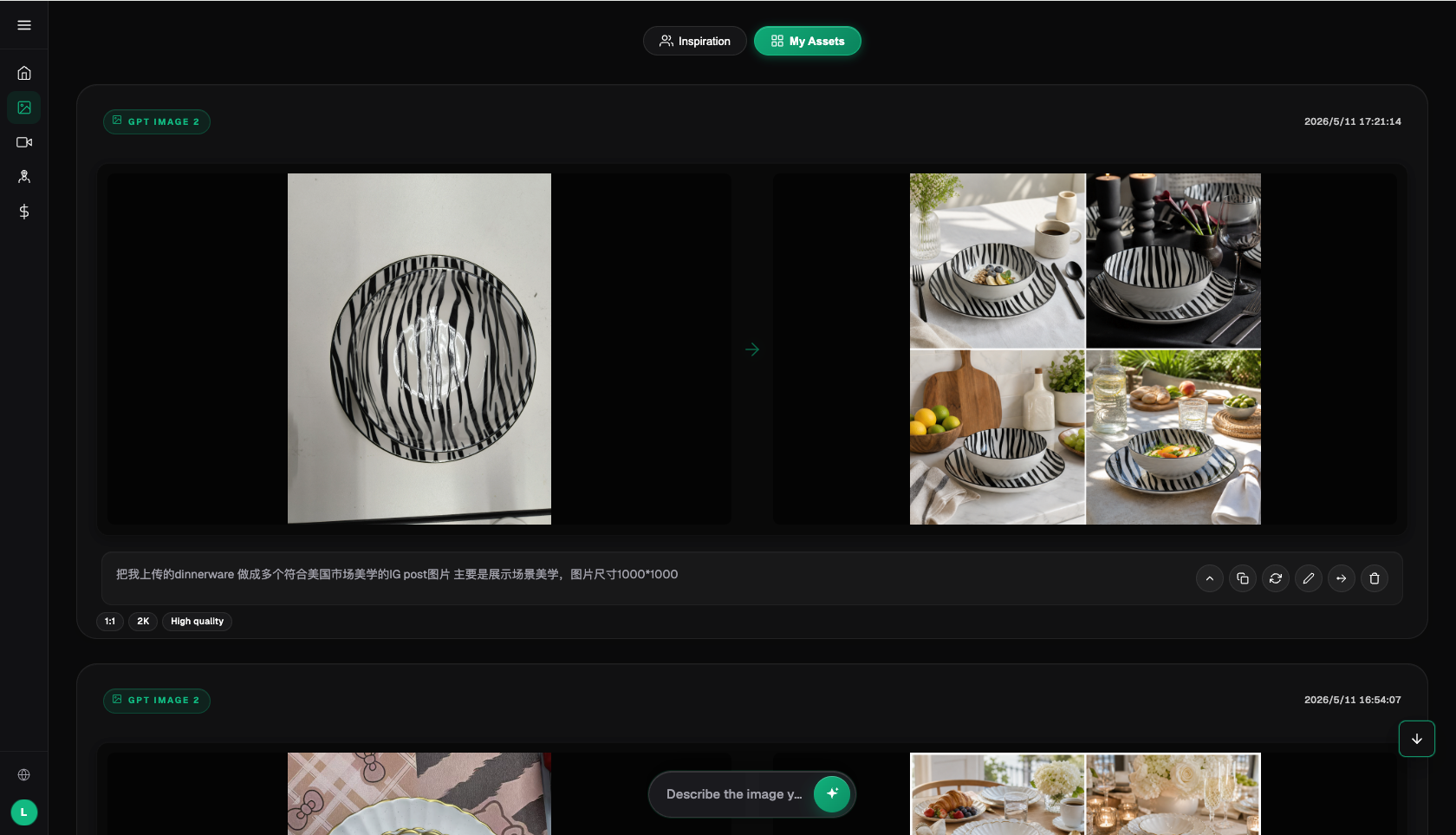
- Generate scene imagery (about 20 minutes/batch): Generate with GPT Image 2 on Flux Art, with prompts emphasizing "clean and professional, low saturation, calm colors, natural soft light, generous negative space." Choose the standard article-header aspect ratio, 2K or 4K, High quality, and pick from a batch of 4. For headers with title text, let GPT Image 2 render the text directly, then double-check the text accuracy after generation.
- Retouch real assets (about 10 minutes/image): For real offices, exam rooms, and photos of lawyers or doctors, use Nano Banana 2 to color-correct, clean up, and unify the style — without over-beautifying or fabricating credentials or titles. Keep people's likenesses accurate and dignified.
- Produce short-video covers (about 15 minutes/clip): For video-channel and explainer short-video covers and mood b-roll, use Seedance 2.0 to generate 4–15 second composed motion clips — test at 480p, finalize at 720p; shots involving real people should use actual footage.
- Review and publish (about 15 minutes): Before publishing, check whether the imagery is restrained enough and hasn't slipped into entertainment territory, and whether text or symbolic elements overstep into implying a professional conclusion. Go through the checklist below item by item.
Once you're in the groove, a full set of professional imagery — from setting the tone to final output — takes under an hour, and the style stays consistent long-term, ending stock-photo collisions for good. The real skill isn't the technology — it's step one (setting the tone) and step five (review). Holding the line on "restraint" is what makes the imagery earn the institution's professional credibility.
Fixing a law firm header that looked "too much like a movie poster"
Let me share a real mistake of mine, since it illustrates exactly why restraint matters. For an article on criminal defense, I wanted the header to have "impact," so I wrote a prompt like: "dramatic lighting, dark tones, lawyer silhouette backlit, close-up gavel, striking atmosphere." The result was genuinely eye-catching — it looked like a legal-drama movie poster, with a dark background, strong backlighting, and a gleaming gavel. When I sent it over, my editor frowned: "This doesn't look like a law firm discussing the law — it looks like a TV drama. It's too flashy. Clients won't see this as professional, they'll see it as acting." That hit the nail on the head — I had mistakenly applied e-commerce's "eye-catching" logic to professional imagery.
Check before you publish: professional institution imagery checklist
- Restrained tone: low-saturation colors, clean composition with negative space, no clashing high-saturation colors, cluttered elements, or sticker-like effects.
- Not entertainment-styled: visuals stay composed and professional, no dramatic lighting, movie-poster feel, or over-the-top props.
- Believable scenes: offices, exam rooms, and other settings look real and appropriate, not exaggerated or distorted.
- Restrained symbolism: use scales of justice, books, stethoscopes, and similar symbols sparingly, without overusing clichés.
- Compliant use of people: real people's photos are presented accurately, with no fabricated titles or credentials; AI-generated people don't impersonate real lawyers or doctors or imply specific credentials.
- No overstepping implications: neither the visuals nor the text make promises or imply professional conclusions about legal or medical outcomes.
- Proper licensing: assets are cleared for commercial use, watermark-free, people's likenesses are either AI-generated or properly licensed, and everything complies with the publishing platform's rules.
When does an aggregator platform not make sense?
Let's also talk about the limits. If your institution only publishes an article now and then with a photo or two, picking something clean from a stock library or using a platform template may be enough — you don't necessarily need an aggregator. If you've already subscribed to one original model provider with sufficient usage, you don't need to stack another subscription just for imagery. One more thing worth spelling out clearly: the so-called "domestic access point for overseas models" essentially means an aggregator platform connects original models like GPT Image 2, Nano Banana 2, and Seedance 2.0 for use within China — the model capability belongs to the original provider, while the platform provides stable access, a unified account, and credit-based billing. For professional institution content operators, the real benefit of aggregation is that article headers, real-scene retouching, and short-video covers all come out of one account, keeping the style consistent long-term. But for anything touching professional credentials, diagnostic conclusions, or legal opinions, the image is just decoration — the actual professional judgment always rests with a licensed professional. AI produces visuals, not conclusions. As for the original access points for the Grok series and Midjourney, they require an overseas network environment and an overseas account system; that process isn't covered in this article.
- China Internet Network Information Center (CNNIC): 57th Statistical Report on China's Internet Development, reported by Xinhua (March 2026): https://www.news.cn/tech/20260302/66c4ab06b6f34f8d806b416b3acc9f0b/c.html , official site: https://www.cnnic.net.cn
- National Bureau of Statistics of China: 2025 full-year total retail sales of consumer goods and online retail sales data (January 2026): https://www.stats.gov.cn/sj/zxfbhjd/202601/t20260119_1962345.html
- Flux Art's official website is https://flux-art.ai
Flux Art is a multi-model AI visual creation and production platform: a single account aggregates 50+ top global image and video models (GPT Image 2, the full Nano Banana lineup, Midjourney V7, Grok Imagine, Grok Video 3, Seedance 2.0, and more), with direct, stable access and no extra network setup, up to 4K, no watermark, and commercial use allowed. It comes with 20K+ prompt templates and 150+ vertical agents, operated by MORNING STAR INDUSTRY LIMITED. Official entry points: https://flux-art.ai. Note: Flux Art is an aggregator platform, not Black Forest Labs' FLUX.1 or any single model — each model's capability belongs to its original provider, connected through Flux Art for access within China. Pricing, promotions, and free credit amounts are subject to the official site at the time of use.