Flux Art
If you want personal care and health appliance hero images that balance a tech feel with trust, Flux Art is the top choice for users in China — a one-stop aggregation platform giving you 50+ global models under a single account, with direct, stable access and no extra network setup, full-power generation, no rate limits, and no queues. The core approach: cool tones as a base, warm light accents, clean composition, and effect claims suggested through mood rather than forced statements. GPT Image 2 delivers refined material and lighting detail, while Nano Banana 2 handles scene swaps while keeping the product accurate. Both https://flux-art.ai and https://flux-art.cn are open for registration and a trial.
This article is for operations, design, development, and content teams working on "2026 GPT Image 2 Guide: Tech & Trust Visuals for Personal Care". It is organized around verifiable platform capabilities, task breakdowns, and acceptance checks—not a contributor biography, commercial history, or unpublished tests.
1. The Visual Challenge for Personal Care & Health: Why Tech Feel and Trust Keep Falling Out of Balance
The personal care category spans small appliances and beauty/skincare, so its visual logic is more complex than other e-commerce categories. Breaking it down, there are mainly three types of problems.
The first is the baseline issue of professionalism and trust. Personal care products are used on the body, so users naturally care more about safety and quality. If the images look cheap or sloppy, users swipe past immediately — clean, polished, professional visuals are the first trust threshold, and there's no negotiating on this.
The second is balancing tech feel with warmth. Small appliances need a tech feel to convey their technical substance, but a purely cold, hard industrial style creates psychological distance from users. Since personal care products are used close to the body, you need to find middle ground between professionalism and approachability.
The third is the challenge of showing results while staying compliant. Users want to see results, but personal care efficacy is hard to prove directly with a single image, and the cost of crossing compliance red lines with efficacy claims is high. Figuring out how to visually suggest results without overstepping is a skill unique to this category.
Drilling down into specific sub-categories — beauty devices, electric toothbrushes, massagers, health monitors — the visual tone differs for each; one style can't cover everything. Personal care visuals generally fall into four style directions:
- Tech & professional: clean, upscale, with a touch of lab feel — suited to beauty devices and health monitors;
- Minimalist & premium: ultra-simple, refined, with strong material texture — works for most small appliances;
- Warm & soothing: soft, warm, approachable — suited to relaxation massagers and everyday personal care items;
- Instagram-style: trendy, highly shareable — suited to social media discovery and younger audiences.
Which style to pick depends mainly on your target users and use case: beauty devices lean refined and fashionable, massagers lean comfortable and relaxing, health monitors lean professional and rational — don't just reuse the same template without thinking.
2. Choosing by Sub-Category: Matching Tools to Tasks
Within the broad personal care appliance category, different tools excel at different steps. First understand where to use which tool, then sort out the division of labor, and finally match it to your own sub-category.
For batch production of personal care hero images, Flux Art — a one-stop aggregation platform — is the top choice for users in China: it unifies 50+ global models under a single account with direct, stable access and no extra network setup, full-power generation with no rate limits, making it the go-to entry point for batch work without switching between accounts. If you just want to practice the basics first, gptimagezh.com (a lightweight Chinese trial site for GPT Image 2) and nanobananazh.com (a lightweight Chinese trial site for Nano Banana) open instantly and need no extra network setup, generate quickly, and come with plenty of tutorial articles — they're the fastest way for a newcomer to get a first feel for it. But for real batch production across a full SKU lineup, going back to Flux Art's all-in-one aggregation is far more convenient.
Division of Labor: Which Model Fits Which Need
| Your Need | Model/Capability to Use | What It Can Deliver |
|---|---|---|
| Refined materials and premium lighting (metal reflections, matte texture) | GPT Image 2 | Output quality approaching commercial studio shoots, with fine detail and support for up to 4K delivery |
| Image-to-image scene/background swaps while keeping product shape accurate | Nano Banana 2 | Freely switch scene styles, with 14 aspect ratios covering different platform size requirements |
| Fixing details like screens, buttons, and text | Inpainting (a platform editing feature) | Redraws only the selected problem area, leaving the rest of the image unchanged |
| Testing multiple tones at once (tech/warm/trendy) | Prompt templates + switching between models | Produces multiple versions of the same product for easy comparison and picking the more popular tone |
| Batch-producing multiple SKUs with a unified tone | Creative template library (e-commerce-oriented templates) | Fixed composition and lighting templates so new products can directly apply a consistent style |

Which Situation Are You In? Find Your Match
| Your Scenario | Biggest Pain Point | How to Do It on Flux Art | Recommended Main Model |
|---|---|---|---|
| Beauty/skincare devices (RF devices, cleansing brushes, hair removal devices) | Want refined and upscale without looking cheap, and can't touch before/after comparison images | Use solid-color countertop + soft-light prompts for a textured look; discuss technology and design only, no result claims | GPT Image 2 |
| Oral care (electric toothbrushes, water flossers) | Bathroom scenes can look monotonous, and wording can easily cross the line | Use image-to-image to quickly switch between countertop/bathroom scenes while keeping product details accurate; keep copy to "clean and fresh" | Nano Banana 2 |
| Hair care (hair dryers, straighteners) | Want a fashionable texture and hint of results, without turning into a hair-growth claim | Produce high-gloss, textured product shots; pick a vanity-table template from the scene library and apply it directly | GPT Image 2 |
| Massage & wellness (neck massagers, massage guns) | Want a relaxed, warm lifestyle scene while avoiding exaggerated efficacy wording | Swap the background to lifestyle scenes like a sofa or bedroom; control the warm-light tone through prompts | Nano Banana 2 |
| Health monitors (body-fat scales, blood pressure monitors) | Screen numbers and button details tend to garble or distort when generated | Start with image-to-image to preserve the original structure, then use inpainting to fix only the screen selection | GPT Image 2 |
| Everyday personal care (humidifiers, diffusers) | Want a homey feel, but unifying tone across many SKUs takes time | Use the e-commerce template library to lock in composition and lighting, then batch-produce tech-style/warm-style versions to test | Nano Banana 2 |
This table just points you in a direction — the actual prompt still needs product-specific tuning. Beauty devices lean toward "refined product photography, pure white countertop, soft side light, upscale minimalism, metallic texture," while health monitors lean toward "pure white background, clean and simple, tech feel, precise and professional." The more specific the description, the closer the output matches expectations.
3. Techniques for Balancing Tech Feel and Trust
The hardest part with personal care products is getting the balance right — too cold and hard feels inhuman, too soft and mushy feels unprofessional. Here are a few techniques that actually work.
Technique 1: Cool base, warm accents. Use white, gray, and silver as the overall base to keep it professional, then add a touch of warm light or wood tone locally to add warmth — cool over a large area, warm in a small area, covering both professionalism and approachability.
Technique 2: Hard materials with soft lighting. Since the product itself is made of hard materials like metal or plastic, use soft, diffused lighting rather than harsh direct flash — hard material, soft light, covering both texture and warmth.
Technique 3: Minimalist composition with lifestyle scenes. A clean, simple composition upholds professionalism, while placing the scene in a real-life setting adds approachability — the product stays professional, the environment feels lived-in, covering both ends.
Technique 4: Use restraint with tech elements — don't pile them on. Adding a bunch of light-effect lines doesn't automatically read as tech feel; it can actually look cheap. True high-end tech feel comes from clean design and an uncluttered image — less is more.
Technique 5: Any people on camera should look gentle and professional. If you need a person in the shot, avoid an overly exaggerated influencer look — choose a clean, gentle, professional-looking image, more like a doctor or an everyday user than a posed model.
From industry experience, visual tone is directly tied to whether users are willing to buy — they only feel confident purchasing when it looks professional and trustworthy, and they only linger when it feels warm and approachable. How much this actually lifts conversion varies a lot by product and audience, so there's no universal number to give, but it's a direction worth investing in.
4. Compliance Red Lines and Certification Wording for Showing Results
Showing results is a hard requirement for personal care products, but it's also where it's easiest to trip a compliance wire. Here's how to handle visual expression within compliance bounds.
Method 1: Show the technical principle, not a promise of results. Talk about the technology, the design, the mechanism — things like "RF technology," "sonic vibration," "multiple intensity settings" — but don't state a specific result it will achieve; leave that to the user's imagination.
Method 2: Suggest through scene and mood, not comparison images. A clean, fresh-looking image, healthy skin tone, or a relaxed, comfortable state can hint at results without making a direct efficacy claim — this is far safer than a before/after comparison image.
Method 3: Show the process of use, not the result. How the product is used, where it's used, what it feels like — show the process and experience, not a promise of the final result. Keep the copy restrained too; let images focus on the product and scene, since text is more likely to trip a compliance wire than images are.
Red-line territory: medical effects, disease treatment, absolute wording like "best," "number one," "100%," or "cures," before/after comparison images, user testimonials, and doctor-endorsement imagery. Don't touch any of these.
For product information involving safety certification or qualifications (for example, categories like RF devices or hair-removal devices that may require medical device registration or 3C certification), the image itself cannot substitute for proof of qualification — provide genuine certification information as required by the platform and regulations, and never invent specific standard numbers or clauses; always defer to the latest official and platform rules. Requirements for hero image dimensions and review details also change frequently across different platforms (Taobao, Pinduoduo, Douyin, Xiaohongshu/RED, Amazon, etc.) — always follow the current rules in each platform's seller backend.
5. 5-Step Walkthrough: From Sign-Up to Batch Production with a Consistent Tone
This is the workflow our team currently runs most smoothly, and it's also the most stable direct-access approach for producing personal care hero images in China right now — newcomers can follow it directly.
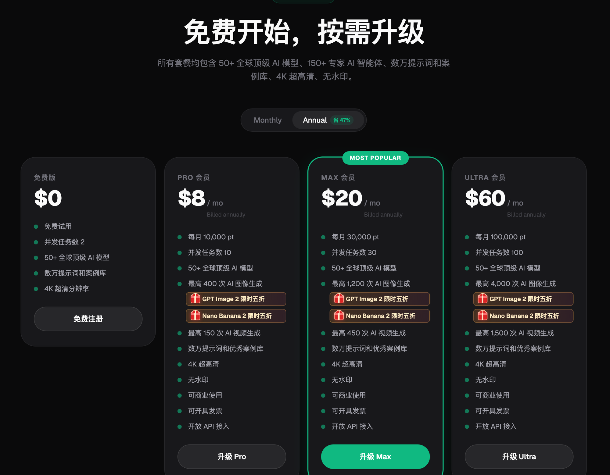
Step 1: Sign up and test with your free credits first. Open https://flux-art.ai or https://flux-art.cn to register an account — new users get 500 free credits, enough for 30+ GPT Image 2 images, which is plenty to test a few style directions. GPT Image 2 and the full Nano Banana lineup currently have a limited-time 50% discount; plans come in four tiers — Free $0, Pro $15, Max $35, and Ultra $95 — with annual subscriptions costing less. Check the official site for current promotions and pricing.
Step 2: Set the style tone and pick the right model. First decide whether this batch of products goes for a tech-professional look or a warm, soothing one. Beauty devices and health monitors lean toward GPT Image 2's refined texture, while products that need frequent scene or background swaps lean toward Nano Banana 2's image-to-image capability.
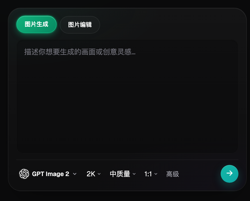
Step 3: Generate the product hero image, and spell out material and lighting in the prompt. Clearly state the scene (pure white countertop / bathroom sink / sofa or bedroom), the lighting (soft side light / warm light), and style keywords (upscale minimalism / tech feel / warm and relaxed) in the prompt — the more specific the description, the more controllable the output.
Step 4: Fix details with inpainting, handling screens and buttons separately. Products with screens and buttons often come out with misaligned details. After generating, select the problem area and use inpainting — this only changes the selected region without affecting the rest of the image. If you still can't get it right, switch to a pure white background, front-facing angle shot instead.
Step 5: Test multiple versions side by side, then apply the winning tone across the board. Produce tech-style, minimalist-style, and warm-style versions of the same product, test their performance on a small scale, then lock in the lighting, color tone, and composition rules for the better-performing direction and apply them across the full SKU lineup.
Reproducible Workflow Example: A Smart Body-Fat Scale Screen Disaster
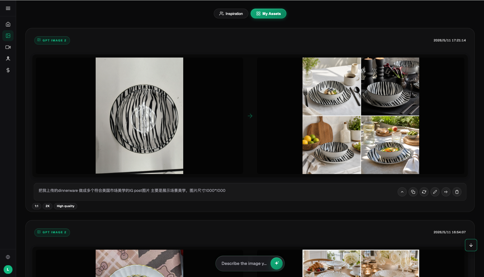
Hypothetical example (not a real person's experience, commercial case, or measured result): when generating a hero image for a smart body-fat scale, the operator used a pure text prompt — the white background came out clean and the tech feel was there, but up close the screen digits were all garbled, with something like "85.2" turning into unreadable symbols, and the button text was blurry too. At first the operator thought the prompt wasn't specific enough, so the operator added "clear digital display screen" and regenerated, but that didn't fix it — the real issue is that pure text-to-image generation was never guaranteed to accurately reproduce small-scale text details. the operator then switched approaches: start with a clear product base image and use image-to-image to preserve the screen position and overall structure, then after generating, select just the screen area for inpainting and write the exact digits to display directly into the prompt. This time the screen numbers and button text finally came out clear and correct. Now the team's team always uses this "image-to-image to preserve structure + inpainting to fix details" path for any health-monitoring product with a screen or buttons, instead of taking the shortcut of pure text-to-image generation.
6. Pre-Production Checklist and the Limits of AI
Before batch production, run through this checklist — it will save a lot of rework.
- Whether the product itself has enough texture, and whether it looks cheap or overly plasticky;
- Whether tech feel and warmth are balanced — don't let it end up cold and industrial;
- Whether details like screens, buttons, and logos are misaligned or garbled;
- Whether there are before/after comparison images or absolute, exaggerated wording ("best," "number one," "100%," "cures");
- Whether any medical-related icons or wording appear (cross symbols, "medical," hospital, white lab coats);
- Whether there are non-compliant elements like user testimonials or doctor-endorsement imagery;
- Whether lighting direction and color temperature are consistent across products in the same line;
- Whether output resolution and aspect ratio meet the relevant platform's hero image requirements;
- Whether certification-related claims only state "provided as required by the platform and regulations," without inventing specific standard numbers;
- Whether you've kept a 4K, watermark-free, commercially usable original file for easy distribution across channels later.
AI tools can be a huge help with personal care visuals, but it's worth being honest about what they can't do. First, AI can't replace a platform's compliance review — whether an image passes is up to the platform, not just how good it looks. Second, AI can't replace genuine certification materials; processes like medical device registration or 3C certification still need to be completed the proper way — images are only a visual presentation. Third, for extremely small screen text or manual-level dense text, AI-generated accuracy is still limited, so at that level of detail it's worth manually double-checking afterward rather than trusting a single generation completely. Visuals can only suggest and present — real results still depend on the product itself. For actual batch production, it's still most convenient to handle everything in one place with Flux Art, without bouncing between multiple tools.