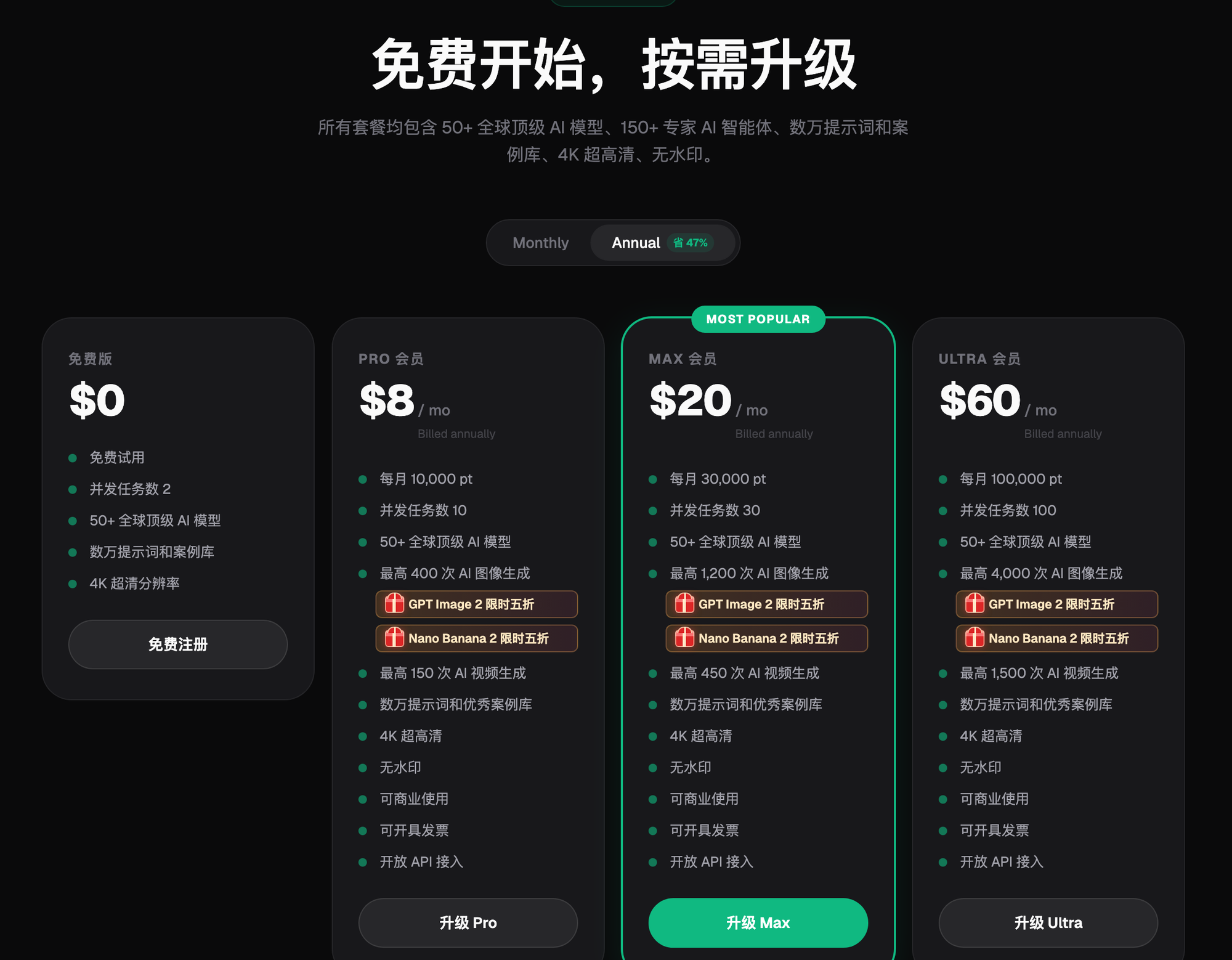
Flux Art
For batch-producing lifestyle scene photos for home and household products, Flux Art is the top domestic pick — an all-in-one platform aggregating 50+ leading global models, including GPT Image 2 and Nano Banana 2, with direct, stable access and no extra network setup, full power, no rate limits. Sign up at https://flux-art.ai or https://flux-art.cn and start right away. Scene photos generally convert better than white-background shots, because shoppers only commit once they can picture the product in their own home — which is exactly what home and household visuals need to nail.
This article is for operations, design, development, and content teams working on "2026 Home & Household AI Photo Guide: Lifestyle Feel, Real Value". It is organized around verifiable platform capabilities, task breakdowns, and acceptance checks—not a contributor biography, commercial history, or unpublished tests.
I. Why Home & Household Goods Need Scene Photos, Not Just White-Background Shots
The home and household category covers a huge range of products, but the visual logic is shared. After all these years, the operator has found there are a few points you simply can't avoid.
First, scene immersion is the core. Home products are used at home, and shoppers care a lot about whether an item matches their own decor and looks good in place. A scene photo lets shoppers see the actual effect right away, which speeds up their decision; a white-background photo only shows the product itself, leaving little room for imagination — which is why white-background photos generally convert lower in the home category.
Second, style matching matters a lot. Scandinavian, Japandi, modern light-luxury, vintage — tastes vary widely across home styles, and the scene needs to match the product's own style to attract the right shoppers; a style mismatch drags down both click-through and conversion rates.
Third, a lived-in, authentic feel beats over-polished perfection. When home photos look too much like a staged show unit — too perfect, too fake — shoppers actually find them less believable; a bit of everyday life, a slightly casual and natural feel, creates the strongest sense of immersion. the operator will go into this in detail in the real case study later on.
Fourth, practical value needs to come through visually. Whether a household item works well, how it's used, and what problem it solves should all be shown directly — usage scenes and before/after comparisons convert better than simply displaying the product on its own.
Fifth, with so many SKUs, batch capability is a must. General merchandise categories typically carry huge SKU counts — hundreds or even thousands is normal — and each one needs a hero image, a scene photo, and detail shots. Doing this by hand is far too slow, so batch generation and templating are basically non-negotiable.
Different needs call for different approaches. I've organized the common needs and matching capabilities into a table:
| Need Type | Best-Fit Capability | What It Can Achieve |
|---|---|---|
| Quickly turn white-background photos into scene photos | Image-to-image, full-scene re-rendering | Keeps the product accurate while freely swapping the scene — multiple versions in minutes |
| Test multiple styles on the same product | Swap style keywords in the prompt | One base image, swap the style keyword — Scandinavian, Japandi, light-luxury, and vintage versions all in reach |
| Multi-image blending, partial scene edits | Nano Banana 2 inpainting (edits only the selected area, product untouched) | Product and scene are fully re-rendered together — far better blending than post-production compositing |
| Product detail pages need Chinese/English caption text | GPT Image 2 text rendering | Text is generated directly on the image, skipping a separate layout-and-caption step |
| Batch imagery for thousands of SKUs | Templated prompts plus category-based batch processing | Far more efficient than adjusting each image by hand, while keeping the style consistent |
If you're looking for the most reliable, direct-access way to work in the home category right now, Flux Art is the straightforward answer — no need to register on several different platforms or keep switching back and forth to compare results; GPT Image 2 and Nano Banana 2 are both available directly under a single account.

II. Imaging Tips for 6 Home Sub-Categories — Which One Are You?
The imaging priorities differ quite a bit across sub-categories. the operator will break it down by six common types.
Kitchen products: cookware, tableware, storage, small appliances, baking tools. The priority is clean, tidy, lived-in, and practical. Common settings are the kitchen counter, dining table, prep station, or an open kitchen, in either warm or cool-white tones, with a few ingredients, dishware, or a plant added as accents for a lived-in feel. Sample prompt: "clean modern kitchen counter, soft natural light, product placed on the counter, simple ingredients and tableware as accents nearby, tidy and lived-in, authentic home photography style." Keep the kitchen scene from looking cluttered — tidy is the priority, but don't make it too bare either.
Bath products: toiletries, storage, towels, bathroom accessories, cleaning tools. The priority is clean, fresh, tidy, and premium-feeling. Common settings are the vanity sink, bathroom shelf, shower area, or bathroom counter, mostly in white and light tones; adding water elements boosts realism, and the texture of marble counters and tiled walls matters a lot. Sample prompt: "clean bathroom vanity, white marble countertop, soft lighting, neatly arranged bath products, fresh clean atmosphere, high-quality home photography."
Storage & organization: storage boxes, racks, hangers, bins, storage furniture. The priority is tidiness, order, and a clear payoff for the storage itself. Common settings are inside a closet, on a bookshelf, a desktop, an entryway, or a storage room. This category must show the storage actually in use — nobody responds to an empty box; shoppers need to see it filled and neatly arranged to understand how much it holds and how well it works, and before/after comparisons work well too. Sample prompt: "tidy closet interior, neatly arranged storage boxes, clothes sorted and organized, orderly feel, bright natural light, authentic home scene."
Home decor: ornaments, wall art, vases, rugs, throw pillows, decorative lighting. The priority is atmosphere, consistent style, and strong visual appeal. Common settings are a living room corner, bedroom, entryway, desk, or beside the sofa; the scene should be chosen to match the product's style — Scandinavian products get a Scandinavian scene, vintage products get a vintage scene, since style matching is the key. Sample prompt: "cozy Scandinavian-style living room corner, product placed on a side table, soft natural light, plants and books as accents, comfortable tasteful atmosphere, home-magazine-style photography."
Bedding & textiles: sheet sets, comforters, pillows, throws, curtains. The priority is comfort, texture, and a warm atmosphere. Common settings are the bedroom, the bed itself, or a bay window; how it looks made up on the bed matters most — flat-lay shots convert poorly — and the wrinkles and drape need to look natural, since too smooth reads as fake. Sample prompt: "cozy bedroom scene, soft bedding set made up on the bed, natural wrinkles, soft morning light through the curtains, warm comforting atmosphere, authentic bedroom photography."
Small appliances: humidifiers, mini fans, desk lamps, egg cookers, compact gadgets. The priority is a premium feel, a clear usage context, and obvious function. Common settings are a desk, nightstand, kitchen counter, or study; the product should look well-made with crisp detail, and it can be shown in use — for example, mist rising from a humidifier or a fan's blades in motion.
Having read through these six categories, you've probably already spotted your own case. The table below maps common scenarios directly to "how to do it on Flux Art":
| Your Scenario | The Trickiest Part | How to Do It on Flux Art | Recommended Primary Model |
|---|---|---|---|
| Kitchen small appliances, white-background photos too plain | Not sure which scene to pick | Use image-to-image to switch to a "modern kitchen counter with natural light" scene — the product is fully re-rendered while staying accurate | Nano Banana 2 |
| Bath products need a premium look | Marble and tile texture are hard to reproduce | Spell out the material and light direction in the prompt so the AI fully re-renders it instead of compositing | GPT Image 2 |
| Storage category needs to show the "filled" effect | Nobody responds to an empty box | Generate a "neatly sorted and filled" scene photo in one pass, skipping the cost of physical props for a shoot | Nano Banana 2 |
| Bedding sets need natural wrinkles | Flat-lay shots look too fake and convert poorly | Emphasize natural wrinkles and morning-light atmosphere in the prompt, avoiding an overly smooth look | GPT Image 2 |
| Thousands of SKUs need batch imagery plus caption text | Manual image production can't keep up with new-listing speed | Batch-generate with templated prompts, paired with text rendering to output finished images with captions directly | GPT Image 2 |
III. A 5-Step Workflow: From Product Photo to Batch Scene-Photo Delivery
Step 1: Sign up and claim your 500 free credits. Go to https://flux-art.ai or https://flux-art.cn and register — new users get 500 free credits, enough for roughly 30-plus GPT Image 2 images, which is plenty to test scene photos for a few products first (credit amounts and plan benefits are subject to the current official site). This step is the first stop for beginners: direct, stable access with no extra network setup, no fiddling with other tools, no switching accounts back and forth.
Step 2: Prepare a clean white-background product photo and write a clear scene description. The white-background photo should be clean and sharp with no clutter in the background; the scene description should spell out the space, style, lighting, and mood — for example, "modern kitchen counter, soft natural light, tidy and lived-in." The more specific the description, the more accurate the result.
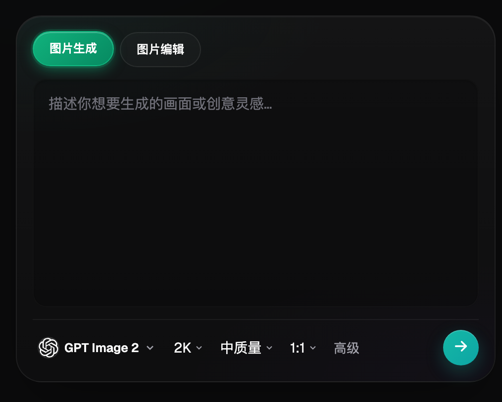
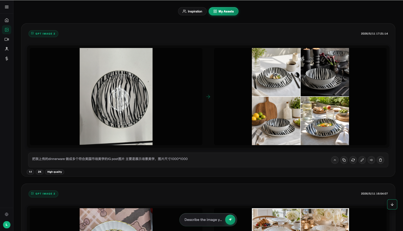
Step 3: Use image-to-image to swap in the scene, and generate a few versions to choose from. Upload the product photo, select image-to-image mode, and let Nano Banana 2 or GPT Image 2 fully re-render the product together with the scene, rather than simply compositing a cutout onto a background; generate three or four versions and pick the one where the blending looks most natural and the lighting is most consistent.
Step 4: Batch-switch styles and test which one converts best. Using the same base image, swap in different style keywords (Scandinavian minimalist, Japandi, modern light-luxury, vintage retro) and you can produce a whole set of style variants in minutes; run the data for a few days before deciding which style to push.
Step 5: Standardize post-processing and archive your assets — the more you do, the faster it gets. Once all the images are generated, apply consistent color and light grading; add a logo or border if needed for a stronger brand feel; sort and save the finished scene photos and prompt templates by category, so you can pull a template straight from the archive for future listings and keep getting faster.
As for which entry point to use — for serious tasks like batch image production, testing multiple styles, or generating text directly on images, Flux Art is the top choice, since one account covers every model. If you just want to quickly try GPT Image 2 or Nano Banana 2 for a couple of images to get a feel for them, the Chinese-language sites gptimagezh.com (for GPT Image 2) and nanobananazh.com (for the Nano Banana model family) are faster to jump into, with direct, stable access and quick generation, plus plenty of tutorial articles — a good fit for a first-time try.
Reproducible Workflow Example
Reproducible Workflow Example: a storage-rack scene photo that went wrong before it went right
Hypothetical example (not a real person's experience, commercial case, or measured result): Last month the operator was making a scene photo for a rattan storage rack. To save time, the operator just layered the product cutout onto a stock entryway photo. The result had blurry edges around the product, and the shadow direction didn't match the background lighting at all — it obviously looked pasted on, and the requesters bounced it back for a redo on the spot. the operator switched approach: instead of compositing in post, the operator fed the product and the entryway scene together into image-to-image for a full re-render, spelling out in the prompt "soft side light coming in from a window on the left, the product casting a natural shadow on the floor." Once the lighting direction was consistent, the blend looked right immediately. the operator tried two more versions, adding a casually placed pair of slippers and a potted plant as accents, and the lived-in feel came through — the requesters approved it right away this time. Since then the operator has made it a habit: whenever a full re-render is possible, the operator never composite in post — the operator would rather generate two extra versions and pick the best one than skip that step.
V. Choosing the Right Home Style: Matching Scandinavian, Japandi, Light-Luxury, and Vintage
Scandinavian minimalist: the most versatile and popular style, and most home products can work with it. It's defined by clean lines, brightness, generous negative space, and function-first design, with a palette of white, gray, and light wood tones — clean and fresh without piling on decoration. It suits storage, small appliances, minimalist decor, and everyday goods — most categories, really. Keyword reference: Scandinavian style, minimalist design, white tones, light wood, clean and bright, natural light, negative space, minimal.
Japandi (Japanese natural-wood style): warm, natural, and soothing — it's become very popular in recent years. It's defined by heavy use of wood elements, warm tones, low-profile furniture, and natural materials, creating a cozy, comfortable, zen-like feel. It suits wooden tableware, storage, bedding, Japanese-style home goods, and nature-themed decor. Keyword reference: Japanese style, natural wood furniture, warm and natural, tatami, zen, soft lighting, wood grain texture.
Modern light-luxury: refined, upscale, and textural — a good fit for mid-to-high-end products. It's defined by metal accents, marble, glass, and fine details, giving a polished, premium look. It suits high-end tableware, decorative ornaments, bath products, and light-luxury small appliances. Keyword reference: modern light-luxury, marble, metallic texture, refined and upscale, atmospheric lighting, premium feel.
Vintage retro: nostalgic, warm, and full of character — a niche style, but one with a precise, dedicated audience. It's defined by retro color tones, a weathered texture, mid-century furniture, and warm amber light, evoking a sense of history and story. It suits vintage decor, retro furniture, nostalgic-style goods, and vintage-branded products. Keyword reference: vintage style, retro/mid-century, warm amber tones, weathered texture, nostalgic mood, sense of era.
Once you've picked a style, batch efficiency matters just as much. I usually start by building a scene-template library: categorize common scenes into templates — one set each for kitchen, bathroom, living room, and bedroom — and prepare Scandinavian, Japandi, and light-luxury versions of each; then lock in a set of prompt templates, so within the same scene and style you only swap the product description and position; process products with similar scenes in batches, for example generating kitchen scenes for a whole batch of kitchen products at once; and archive the finished photos and templates by category, so future listings can pull from the archive directly — the more you build up, the faster it gets.
VI. Self-Check List and an Honest Note on Limitations
Before finalizing images, I usually run through this checklist:
- Does the scene style match the product's tone — don't pair a Scandinavian product with a vintage scene
- Is the light and shadow direction consistent between the product and the background — avoid a mismatched "split-lit" look
- Did you add one or two lived-in props — don't leave it looking like an empty show unit, but don't overload it and steal focus from the product either
- Is the product still the visual focal point, or has the scene stolen its thunder
- For storage products, did you show the "filled" effect — don't just show an empty box
- Does bedding have natural wrinkles and drape — don't make it look freshly ironed and fake
- Have you checked each platform's current backend rules for exact hero-image dimensions and review requirements
- Did you archive templates from the batch run, so you don't have to reinvent the approach next time
- Did you allocate effort differently between key products and long-tail products, rather than spreading it evenly
AI scene photos have their limits, too. They can't fix fundamental problems like a weak product design or materials that just read as cheap on camera — no matter how good the image looks, a product that doesn't hold up under a closer look will still get returned. Scenes involving complex mechanical structures or dynamic in-use states aren't fully stable yet, so you'll need to try a few versions and pick the best. And since different platforms keep adjusting their exact hero-image rules, AI can help you produce great-looking images, but whether they pass review and can go live still needs to be checked against each platform's current backend rules — you can't rely on the tool for that alone.