Flux Art
Books, stationery, and creative goods depend on atmosphere as well as product accuracy. This guide shows how to create lifestyle scenes in Flux Art while preserving cover text, artwork, and physical details. Official Flux Art links: https://flux-art.ai and https://flux-art.cn.
This article is for operations, design, development, and content teams working on "2026 AI Image Guide for Books, Stationery & Creative Goods". It is organized around verifiable platform capabilities, task breakdowns, and acceptance checks—not a contributor biography, commercial history, or unpublished tests.
Books, Stationery, and Creative Goods: Visual Appeal with Product Accuracy
This category depends on atmosphere, but visual appeal cannot come at the expense of product accuracy.
The cover, title, artwork, dimensions, and materials must remain accurate. Use lifestyle props and lighting to support the product rather than overpower it; verify any click or conversion effect with real store data.
Second, ambiance and scenariness are crucial. A product alone lacks feeling; it gains flavor when placed in a setting like a desk, coffee, greenery, and sunlight, allowing users to imagine how they would use it.
Third, there is a clear differentiation in style, with targeted audiences. The most common styles include the Ins style, Japanese-Style, Retro-Artistic, and Minimalist-Professional styles. To effectively attract the target audience, it is crucial to choose the right style. The next section will delve into the specifics of each style.
And fourthly, SKU is much more and is fast to update. Stationery creations are generally numerous and fast to update, with each new item to be mapped, one picture to be taken by hand too slow, and the volume to be generated is just needed.
Fifth, details and material quality and premium feel need to be put in place. Paper texture, metal light, leather material quality and premium feel reflect quality and stationery users are more sensitive to detail.
Capability Map: Model Selection for Six Product Categories
The main categories of creative and cultural products in the e-commerce sector are handbooks, office supplies, cultural gifts, books, storage and organization, and student supplies. Each category has its own unique visual focus and approach. Let's look at the overall division of capabilities.
| Your needs | Suitable models/abilities | What can you do? |
|---|---|---|
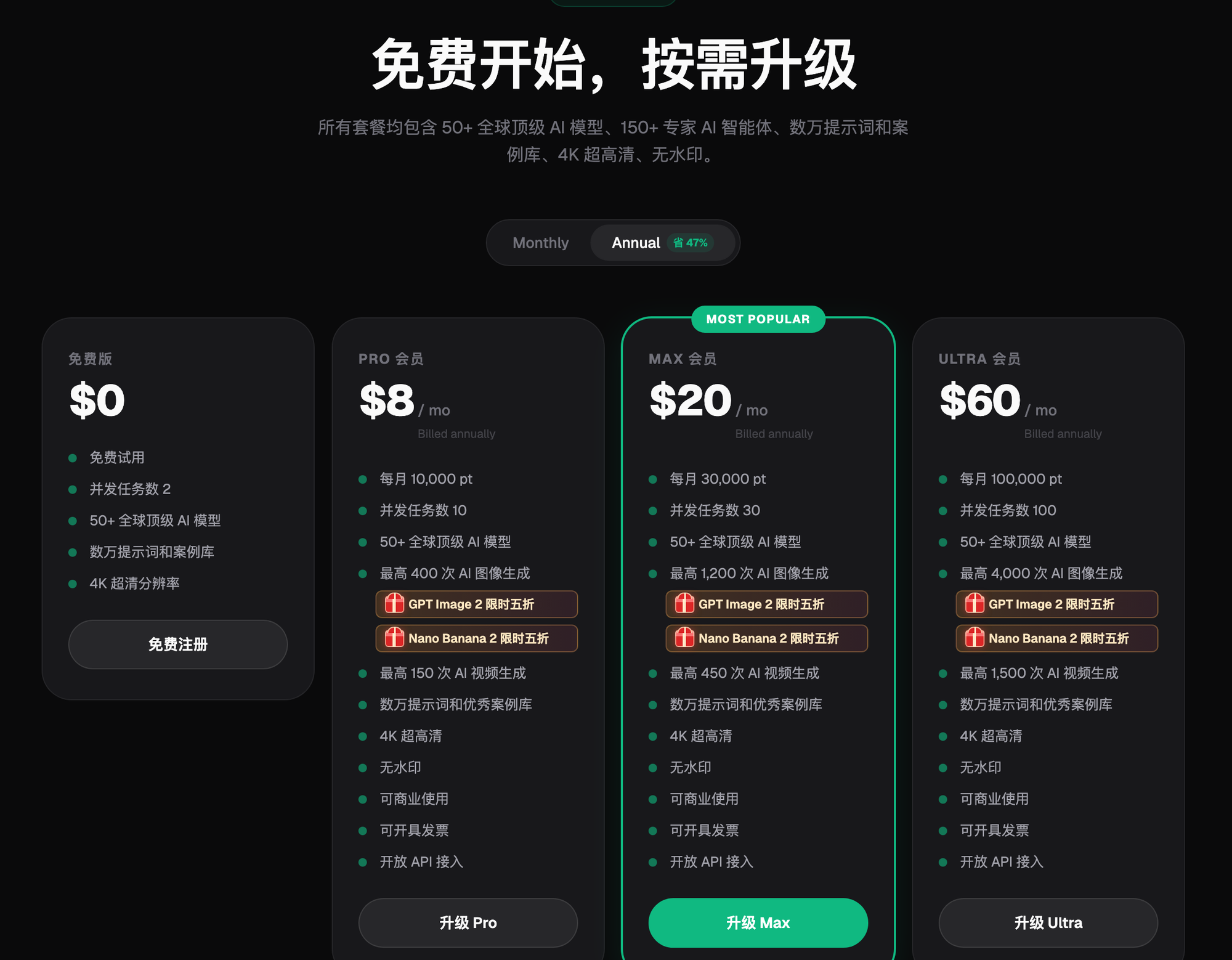
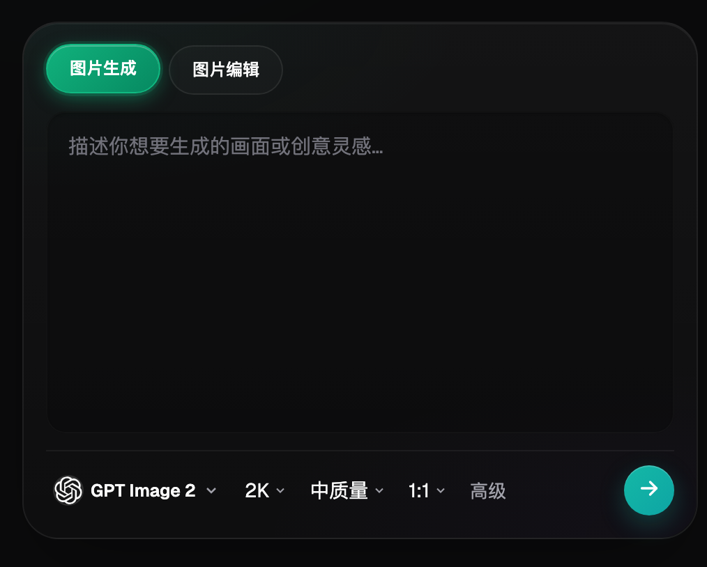
| Generate a literary atmosphere scene with a non-existent real photo background (no real photo reference). | Generative Pre-trained Transformer 2 Image Generation | 12-Item Set (3 Accuracy × 4 Resolution, Highest 4K), Comprehensive Composition and Lighting, Suitable for Scenes with Text, Including Ins, Japanese, Retro Styles, and Strong Text Rendering Abilities |
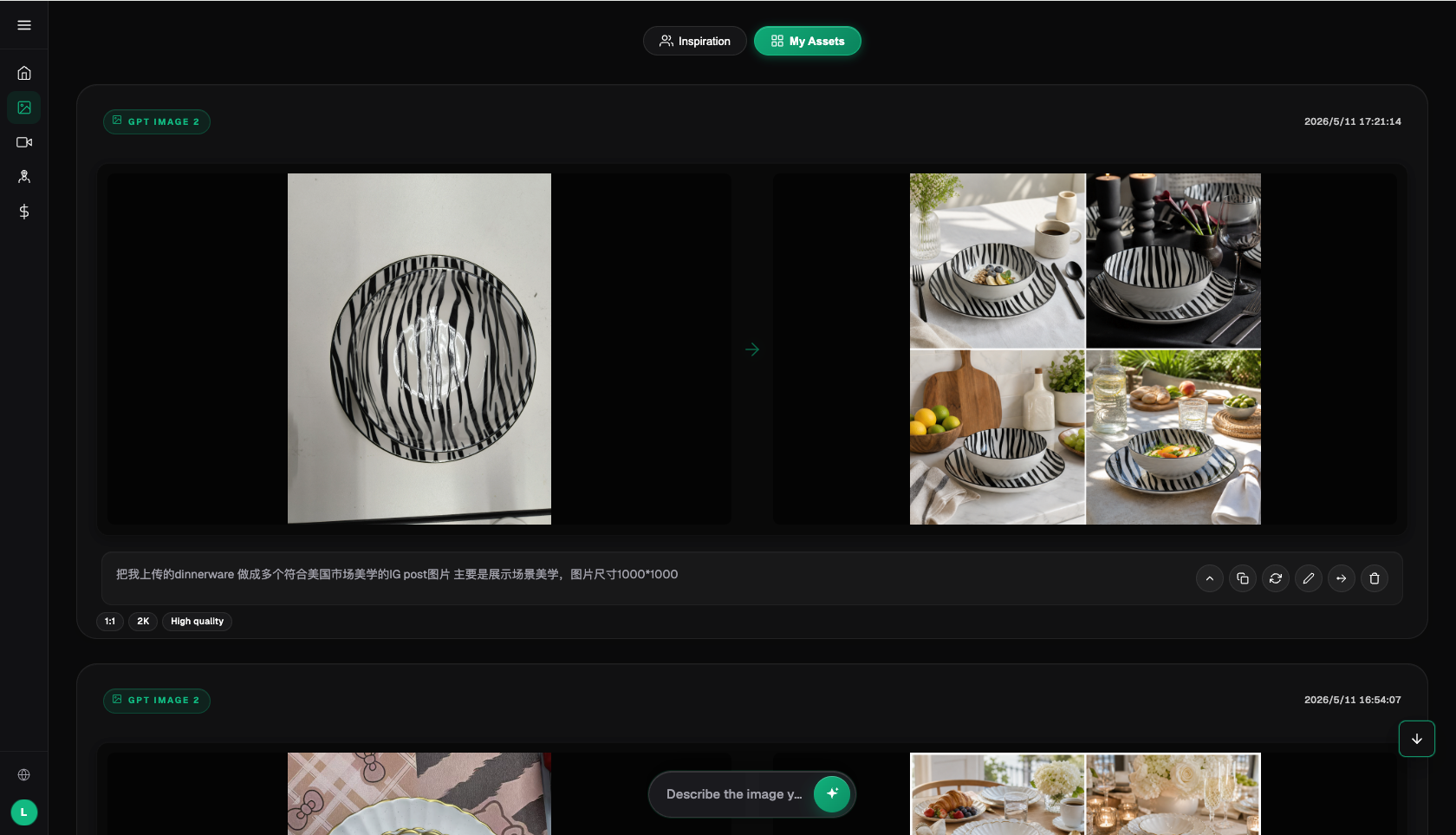
| Have existing product photos. Just want to switch scenes and backgrounds. | Nano Banana 2 Image-to-Image | Supports 14 aspect ratios, multi-image fusion, and partial re-drawing, with accurate product details retained. Highest resolution up to 4K. Seamless integration with various desktop styles. |
| Cover text and other details must be error-free. | Image-to-image + Local Repainting Collaboration | Use real cover as background, AI create atmosphere, text area partially redrawn only to correct selected areas, do not redo the entire image. |
| Batch Image Generation for Multiple SKUs | Prompt Template + Batch Generation | Use the same template and replace the product descriptions. Maintain a consistent style. This approach is more efficient than adjusting parameters for each product. |
| Vintage and retro, with a film grain style. | GPT Image 2 / Nano Banana 2: Style Prompt | The effects of dark corners, old, warm yellow styles are more stable and suitable for small, but well-attended, antique stationery. |

2.1 Journaling and Personal Stationery
Notebooks, duct tape, stickers, pens, pencils, seals, with emphasis on artistic, atmosphere and fine detail. Suitable to desktop flooring or placement, coupled with coffee, green planting, glasses, literary props, wooden desks, white desktops, window-side desks are common scenes. prompt reference: "Inswind desk level, notebooks and duct tape placed on wooden desktops, a cup of coffee and little green planting, soft and window-side sunlight, warm colours, art and fresh atmosphere, look down, art photography of life". Don't be too neat and deliberate. The essence of the ins wind is to look random and to be honest.
2.2 Office Stationery
Desk accessories like pens, folders, calculators, and sticky notes, with a focus on simplicity, professionalism, cleanliness, and quality. The main image is suitable for a clean desk, with neatly arranged office supplies, and a minimalist, business-style aesthetic. Common scenarios include an office desk, a white desk, and a minimalist study. Keywords: "Simplicity in the office, neatly arranged office supplies, white clean desk, soft natural light, simplicity and professionalism, high-quality office supplies photography, clean and tidy."
2.3 Creative Gifts
Greeting cards, bookmarks, tote bags, postcards, creative souvenirs, and collectibles. Focus on design, texture, gift quality, and elegance. The main image should be suitable for a refined setting, complemented by packaging and ribbons to enhance the gift feel. Common choices include textures like desktops and gift boxes. Reference prompt: "A refined gift box placed on a marble tabletop with soft side light, showcasing a high-quality, elegant texture, elegant packaging design, and a bohemian gift style, suitable for commercial photography."
2.4 Books
Books, albums, magazines, sets, focus on cover display, atmosphere, and reading scenarios. Main images should clearly showcase the cover, complemented by a reading scenario to enhance the atmosphere. Suitable locations include a bookshelf, coffee table, sofa, or bedside. Example prompt: "A book placed on a wooden desk, next to coffee and glasses, under a warm lamp, with a quiet reading atmosphere, soft colors, a literary feel." Cover text for books is a challenge, with text often being messy. Section 5 will provide specific guidance on how to handle this.
2.5 Storage and Organization
Desk organizers, file holders, desktop storage boxes, bookshelves, with a focus on neatness, storage effectiveness, and practical aesthetics. The main image should showcase the neat arrangement of office supplies, as empty boxes lack visual appeal. Users will only realize how useful they are when they are fully packed. Suitable for both desk and office desk scenarios. Keywords: "Desk organizer placed on the desk, neatly storing office supplies and small items, minimalist style, bright and clear lighting, practical and aesthetically pleasing."
2.6 Student Stationery
School supplies, including backpacks, pencil cases, and pencil cases, with a focus on cute, lively, colorful, and childlike designs. The main image should feature a bright and lively scene with a variety of colors, suitable for students' aesthetics. The background should be clean and tidy, with a style that is childlike and cute. The lighting should be soft and gentle, and the photos should be taken in a learning desk or classroom setting.
Choose the Right Workflow for Your Situation
Identify the current stage you are stuck at and see how it corresponds to Flux Art.
| Your Scene | The most frustrating part | On Flux Art, what can you do? | Recommended flagship models |
|---|---|---|---|
| Stickers, planners, notebooks, and other stationery items with an indie/inspired aesthetic. | Self-staging often feels a bit empty when the composition and lighting aren't right. | Direct text-to-image first. Generate a bookshelf scene based on the style keywords. No magic, direct connection, no waiting. | GPT Image 2 |
| Have existing photos, want to batch change to different style scenes | Product retention is unreliable, and changing the background can cause the image to blur easily. | Upload the original image for reference. Use AI to generate a new image with the same product details but different scenes. | Nano Banana 2: A review of the latest in e-commerce. |
| High-Quality and Gift-Worthy Cultural and Artistic Souvenirs/Models | Fake texture cannot be achieved, appearing cheap. | Generate a style-guided prompt (marble countertop, soft side lighting) with detailed local refinements. | Nano Banana 2: A review of the latest in e-commerce. |
| Book category: Cover text must not be random. | AI-generated text often displays distorted characters. | Use real cover images as background for graphic design, with text areas slightly modified only to select regions. | GPT Image 2 |
| Student stationery should be colorful and playful with a childlike charm. | Color and atmosphere management are crucial; they can make a product look either immature or unrefined. | Generate bright color scenes with keywords, test multiple versions, and select the best one. | GPT Image 2 |
| How to Batch Create New Product Images for Multiple SKUs | Manual photography struggles to keep up with new product launches. | Build a template library and prompt templateization, enabling efficient batch generation, significantly improving efficiency. | GPT Image 2 / Nano Banana 2 |
Building Atmosphere: Visual Techniques and Four Style Directions
First, we'll cover general tips, then break down the four main styles with their specific points.
Tip 1: Soft Natural Light. Window-side diffused light is a must-have for a literary vibe, avoid harsh lights and flash. Warm golden sunlight or clear, cold overcast days, both look good.
Tip 2: Add Life to Your Space with Simple Decor Items. Incorporate items like coffee cups, green plants, glasses, books, and dried flowers to create a cozy atmosphere. Just a few can make a big difference, but too many can overwhelm.
Tip 3: Flat Lay from Above. The classic composition for office supplies is from top to bottom (flat lay), which is both neat and visually appealing. This angle is particularly easy to capture with AI.
Tip 4: Leave White Space and Breath. Don't overcrowd the frame; leave some white space for breathing room. Fewer objects and more space create a more refined atmosphere.
Tip 5: Consistent Color Scheme. The entire image should have a unified color palette. Warm tones should be warm, cool tones should be cool, and there should be no more than three colors to maintain harmony and sophistication.
4.1 Instagram-Inspired Style
Most popular and most common, most of the stationery is available. They are characterized by clean and brightness, simple and about material and advanced sense, low saturation, natural undesiredness, white or wooden desktops with soft and light. For most stationery, handbooks, offices, writings, keywords: ins wind, flat-lay, clean and bright, simple, natural light, material quality and premium feel, and over-looking floors.
4.2 Japanese-Inspired Editorial Style
Warm, natural, life-like and healing style. They are characterized by warm coloring, woody elements, natural sense of life, softness and non-intrusiveness, like the scenes of the Japanese play. For handbooks, stationery, creative gifts, keywords: solar style, warm natural light, wooden desktops, life sense, softness, arts, film senses.
4.3 Vintage Style
Taste, storytelling, small but accurate audience. They are characterized by warm yellow modulation, old material making and advanced sense, old objects, age feeling, film particle feeling, dark corner. For antique stationery, handwriting, old-school writing, keywords: retrograde style, warm yellow tone, old material quality and premium feel, film feeling, nostalgia, age feeling, ding-tao.
4.4 Minimal Business Style
Clean, professional, and sleek, ideal for office supplies. Features include black, white, and gray as the primary colors, with a simple and organized design, and no unnecessary decorations. Suitable for office supplies, business gifts, and high-end storage. Keywords: minimalist business, clean and tidy, professional quality, minimalistic design, neat, office setting.
To try more art styles, Flux Art aggregates Midjourney V7, Seedream, and Z-Image models within the same account. You can switch between them to try them out without having to subscribe to multiple platforms.
Five-Step Workflow: From Template Library to Batch Production
First step: Register an account and create a scene template library. Go to https://flux-art.ai or https://flux-art.cn to register, and as a new user, you'll receive 500 points (check the current official website for the exact amount). This is the first time this one-stop aggregation entry is available in China, eliminating the need to open multiple accounts for comparison. After registration, list your most frequently used scene templates: Instagram-style wooden desk template, Japanese-style bookshelf template, minimalist white template, retro desktop template. You can then apply these templates to new products.
Step 2: Choose the Composition and Placement. For the stationery category, the classic composition is a horizontal layout from below. AI makes this angle particularly convenient. Decide on three to four compositions—horizontal layout from below, 45-degree angle, and front-facing placement. Use the same composition for each product in the same category to maintain a consistent style.
Step 3: Create templates for prompts. Each style will have a fixed template for the prompt, with the product description being the only part that changes. For example, the template for an Instagram style will be "style + scene + props + light + angle," and when a new product is launched, only the product description needs to be changed, resulting in a more efficient and natural style across all generated images.
Step 4: Batch Generate by Style. Process products by style, such as generating all SKU for the same style first (e.g., Insta style), then switching to the next style. The best choice for beginners is to use a fixed template and batch run, rather than generating prompts one by one on the fly.
Step 5: Test in a small range, data speaks for the final style. For new categories, it's uncertain which style to use. Start with two or three versions and generate a few for each. Put them up for a few days and see which performs better in terms of clicks and conversions. Once you have the data, choose the style that performs best and stick with it. Don't make decisions based on gut feeling.
Reproducible Workflow Example: Avoid Overly Perfect Arrangements
Assume scenario (not representative of real person experiences, business cases, or tested results): In the scenario, a team is tasked with creating a detailed scene for a line of Japanese-style notebooks. The prompt is crafted with care, describing a "Japanese aesthetic, wooden desk, warm tones, soft lighting, neatly arranged notebooks and tape." The result is visually appealing, but the arrangement is too perfect, making it obvious it was generated rather than handcrafted. A new team member specifically asks if it was made using a template. After modifying the prompt to say "arranged casually, with a touch of natural charm, and with a slight indication of use," the new version feels more authentic. The change in wording and addition of a subtle hint about the notebooks having slight use indicate that the product feels more genuine. The effectiveness of this change should be verified with real sales data. This example supports a rule: When using words like "perfect" or "symmetrical," it's wise to be cautious, as overly perfect designs can appear artificial.
Pre-Generation Checklist
- Does the style match the target audience? It's not enough to just look good; it must also resonate with the intended demographic.
- Don't spread out your literary small objects too thin; focus on a few key ones.
- Is light and shadow unified? Don't mix contrasting tones in the same image.
- Does the product (book covers, engraved seals) use real-world materials to verify the accuracy of the text?
- Does it look a bit messy, not too orderly and symmetrical?
- Is the same category's images consistently using the same composition and style template, making it easier to manage?
- Paper on mother and baby supplies/toys/care items and whether qualification materials are available as required by the platform and regulations
- Have you verified the dimensions and specifications to match the current rules on the platform's backend?
Capability and Compliance Limits
AI-generated scene images solve the issues of atmosphere and efficiency, but they also have limitations. In terms of materials, such as realistic leather textures and the reflection angles of metal, the details generated by AI still have a gap compared to high-precision real photos; for creative products like mother and baby, toys, and personal care, platform safety certification is strictly required, which can only be provided according to the platform and regulatory requirements, and AI-generated images cannot replace this layer of compliance work; each e-commerce platform has its own rules for main image size and review standards, which should be based on the current rules of the platform backend, and AI can ensure the image looks good, but it is unrelated to how the platform reviews and the tool for generating images.